- | Housing Housing
- | Expert Commentary Expert Commentary
- |
Tracking Michigan's Housing Supply Growth and Decline by Census Tract
Michigan has some of the most depressed housing markets in the US. Detroit–yesteryear’s Silicon Valley–is the archetype of Rust Belt decline. Flint showed the perils of poorly-maintained infrastructure when a change in its water supply source released toxic metals into the city’s tapwater.
Both cities, as well as others in Michigan, have struggled to shrink gracefully. There’s nothing wrong, in principle, with losing population. But unwanted buildings and too-large legacy infrastructure create fiscal, social, and health problems for their communities.
In Housing Supply in the 2010s, I used US Postal Service data to document where the housing supply is growing–and where it is shrinking. The commonly-used data on building permits cannot measure decline, since they do not track demolitions. So this is probably the most detailed publicly-available dataset for identifying which parts of Michigan lost housing units between 2012 and 2018 and which gained.
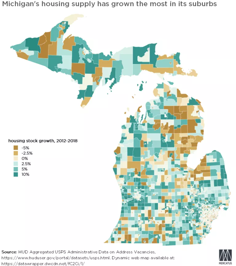
The map shows the rate of housing supply growth (in blue-green) or decline (in brown) by census tract. Since tracts are designed to be of roughly-equal population, clusters of small tracts indicate cities. In Michigan, most of those clusters are brown. The state’s rural northeast is no better; Montmorency County lost nine percent of its housing units in just six years.
The bright spots are in the suburbs–there’s enough growth around Flint’s troubled core that its county, Genesee, added two percent to its total housing stock. (Incidentally, California’s high-rent San Mateo and Los Angeles counties added homes at the same rate.) Similarly, suburban Detroit has added housing at a healthy rate, indicating continued demand for high-quality homes in the region’s troubled economy.
To further understand current housing growth patterns, read Housing Supply in the 2010s. For a dynamic version of the map, which provides granular growth and decline data on census tracts, click here.