- | Government Spending Government Spending
- | Data Visualizations Data Visualizations
- |
Comparing President Obama’s Early Budget with His Mid-Session Review
This week’s charts use data from the Office of Management and Budget to compare the Obama administration’s different budget projections over time. The charts display budgetary estimates of expected revenues, outlays, and deficits from 2008 until 2019. The projections in the Obama administration’s first budget, “A New Era of Responsibility” (NER) are compared against his “Mid-Session Review” (MSR) to see how expectations aligned with reality.
How realistic are presidential budget projections? Even the most careful calculations are susceptible to inappropriate assumptions, misplaced optimism about economic and political conditions, and unavoidable uncertainty about what the future will hold.This week’s charts use data from the Office of Management and Budget to compare the Obama administration’s different budget projections over time. The charts display budgetary estimates of expected revenues, outlays, and deficits from 2008 until 2019. The projections in the Obama administration’s first budget, “A New Era of Responsibility” (NER) are compared against his “Mid-Session Review” (MSR) to see how expectations aligned with reality.
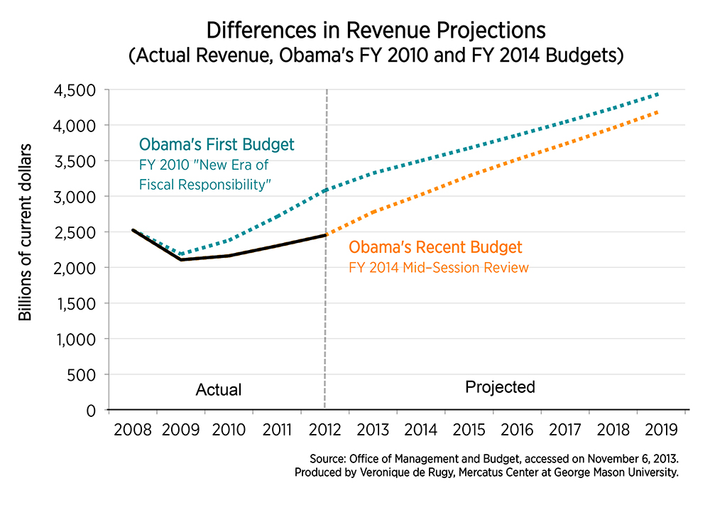
The first chart analyzes the differences in revenue projections among the two estimates. The chart suggests that the revenue projections in the NER were far too optimistic. The Obama administration believed that revenues would climb to over $3,023 billion in 2013, but the revised MSR predicts a much more modest yield of $2,777 billion for this year. This trend continues throughout 2019: the original NER revenue projections are considerably more optimistic than the revised MSR calculations. The second chart, which compares outlay projections among the same sources, tells a similar story. The original NER outlay projections were more optimistic than what actually came to pass. Although President Obama hoped for a more ambitious stimulus program of almost $4,000 billion in outlays to pull the nation out of recession in 2009, actual outlays amounted to a more modest $3,518 billion. Only in 2011 did expected NER outlays match actual outlays. For all other years, the president’s revised MSR outlay projections appear much less sanguine than his rookie NER expectations.
 The final chart displays deficit projections from the two budgets. In this case, the NER overestimated deficits in 2009, but its projections fell short of the deficits actually incurred from 2010 to 2013. Even though the administration spent less than planned in its original NER, the lackluster revenue performance during this time was enough to increase the deficit considerably more than anticipated.
The MSR projects that deficits will fall below the original NER projections by 2016, dropping under $500 billion by 2018. Like most budget projections beyond a short-time horizon, this should be taken with a grain of salt; long-term projections are based on uncertain assumptions that often fail to provide an accurate picture, as shown in the original NER projections. Why should we expect that the president’s revised MSR deficit projections will be any less incorrectly optimistic this time? If recent history is any guide, we should expect the MSR deficits to be similarly distorted by these rose-colored assumptions.

