- | Housing Housing
- | Research Papers Research Papers
- |
"We Are Not as Wealthy as We Thought We Were": Elevated American Household Net Worth Reflects Poverty, Not Wealth
Why rising home prices reflect housing scarcity—and why more homebuilding is the solution
Abstract: From 1975 to 2023, the total value of residential real estate in the United States increased by 59 percent relative to incomes. It is tempting to equate this with increased wealth, but in fact, it signals regressive economic decline relative to the baseline. A series of three observations leads to this conclusion: (1) When aggregate real estate wealth grew because new and better homes were being constructed, it represented real wealth. For more than four decades, the construction of new homes has declined, and higher valuations are due to rent inflation on existing homes. Higher prices on unchanging assets do not represent real wealth. (2) Traditionally, as family incomes increased, aging homes filtered down to new tenants with lower incomes. The decline in new home construction has reversed that process. Today, successive tenants in existing homes frequently have higher incomes than the previous tenants. In other words, the typical American family today lives in worse housing compared to families in recent decades with the same real incomes but pays a larger portion of income for it. (3) In seven years, from 2015 to 2022, American real estate valuations increased by 20 percent relative to incomes. During that period, rising rents reduced household incomes, net of rent, in the lowest income quintile by 15 percent. Higher aggregate housing wealth is associated with regressively lower real incomes. The implication of these observations, as a group, is that the high measure of American real estate wealth is not the result of better housing and rising standards of living. It is the result of a regressive transfer of incomes from tenants and new homebuyers to existing real estate owners. The rate of new home construction has become so constrained that many families have been unable to reduce their consumption of housing at a fast enough pace to maintain historically normal nominal housing expenditures in the face of rising rents. Frequently that is because economizing for families with the lowest incomes requires displacement from their home neighborhoods or regions. The late-20th-century rise in reported household real estate wealth largely reflects families’ resistance against moving under economic duress in a housing-poor economy.
Introduction
In 2012 the US Census Bureau noted that between 2007 and 2010 the median American family had lost 39 percent of its net worth, mostly because of the collapse in real estate values, and the median American family’s income had also fallen by 7.7 percent. American economist, author, and public intellectual Tyler Cowen summed up the census conclusion succinctly: “We are not as wealthy as we thought we were.”[1] The data seemed to reveal that the high prices of homes in 2005 were not a true reflection of wealth because they had not been justified by a corresponding rise in rental value and, instead, stemmed from a cyclical bubble.[2]
Two decades later, home prices have returned to similarly high levels, but under very different conditions. In 2025, economists have been less likely to ascribe high home prices to an unsustainable bubble. Rents are now much higher and, unlike in the 2000s, there is no lending boom. Yet, “We are not as wealthy as we thought we were” is more true today than it was in 2005. And, ironically, it is more true because the high prices of homes today are justified by their high rental values.
Understanding why rents have risen so sharply requires looking at the long-term undersupply of housing. Inadequate residential investment has left Americans woefully underhoused. For decades the real value of housing structures relative to real incomes has been declining. The high rents are not, on average, for better houses; the high rents are for the land under those houses. More specifically, high rents are for the permission to have a house. The permission is attached to the land under the house and is tightly controlled by urban planning departments. Home prices are highest where land-use controls create the most obstacles to the construction of new homes. Where the number of new homes is held perpetually too low, the prices of existing homes become permanently inflated.
This chronic shortage interacts with the natural cycles of housing demand, amplifying their effect. An endemic supply shortage leads to persistent rent inflation over time. But housing demand is cyclical, so obstructed supply becomes most disruptive and noticeable at the peak of demand cycles. As inadequate supply pushes rent inflation higher at each successive cyclical peak, the demand cycles appear larger. It is tempting, then, to focus on demand-side explanations for high housing costs. There is hardly a moment where supply appears to be the most important element, even when it is. In fact, as supply conditions worsen, deeply negative cyclical conditions can appear to be reversions to normal conditions rather than aberrations from a neutral market. Figure 1 shows an idealized reflection of this process.
These cyclical misreadings have serious policy implications. Both during the Great Recession in 2008 and today, this misunderstanding of housing-market dynamics has led to common calls for recession as a way to bring housing costs down.
FIGURE 1. Divergent real estate value trends under ample vs. inadequate housing supply
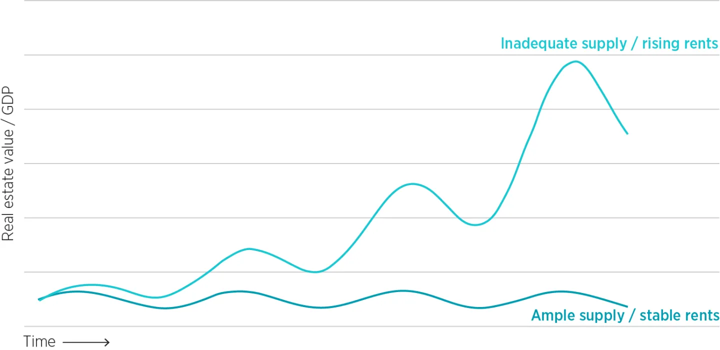
Source: Author's representation.
The intuition to slow the economy and to create or allow economic harm has been so ubiquitous that it is almost difficult to cite. It is the proverbial water we are swimming in. The primary cause of the Great Recession was that policies that would have mitigated the downturn were universally unpopular because the general public viewed high home prices as a sign of cyclical excess that must be corrected.[3]
Here are just a few examples:
- At the end of August 2007, when the Federal Reserve met for its annual meeting in Jackson Hole, Wyoming, new home sales were down a whopping 50 percent after nearly two years of decline, but home prices remained near their peak. Prominent economists Ed Leamer and John Taylor argued for tight monetary policy because they believed the Federal Reserve had created high home prices and high prices had been associated with too much supply. Leamer’s reference material was his recently completed paper that identified declining housing starts as a key leading recessionary indicator.[4]
- In the period leading up to the September 2008 crisis, the Federal Reserve explicitly aimed for declining housing construction and home prices. Arguing against a rate cut in September 2007 amid financial panic, head of the Dallas Fed and voting member of the Federal Reserve rate-setting committee Richard Fisher said, “I’m very concerned that we’re leaning the tiller too far to the side to compensate risk-takers when we should be disciplining them.”[5]
- In April 2009, Nobel Prize–winning economist Vernon Smith and Steven Gjerstad published an article arguing that inflation estimates should reflect home prices rather than just rents, and that would have justified a much earlier economic downturn to keep prices lower. Oddly, they did not argue for looser economic policy at the time of the article, even though, if they had continued to apply their own measure, they would have had to report that the economy had been experiencing deep deflation for more than two years. Such was the effect of high home prices on cyclical sentiment. Few expected Fed Chair Paul Volcker to reverse 1970s inflation with 1980s deflation, yet even after September 2008, pundits and economists saw deflated home prices as a corrective normalization.[6]
- High home prices have a similar effect on cyclical sentiment at a more local level, when locals oppose economic and employment growth because of their effect on housing costs.[7] In both Seattle and New York City, Amazon has faced opposition because it has created many high-paying local jobs.[8]
Calls for policies that would slow the economy or limit access to credit or money have been an important side effect of a disruptive supply constraint. It could be said that the various attempts to reduce the high costs of housing by decreasing demand or banning various types of buyers or tenants are all attempts to make ourselves poor enough to match our poor housing supply. “We’re not as wealthy as we thought we were” has been a policy choice.[9] Briefly after 2008, the Great Recession made us poor enough to match our poor housing supply, and home prices briefly seemed almost normal.
There is an existing literature about the inflationary effects of inadequate supply.[10] In the years since the 2008 housing bust, low housing production has been associated with a continuation of elevated prices.[11] Yet, the inflated salience of short-term cyclical changes has produced an overwhelming bias in academic and policy discourse toward demand-side explanations for high housing costs. Various schools of thought attribute rising housing costs to different forms of excess, including excess use of debt[12] and capital,[13] reckless investment behavior,[14] overly optimistic sentiment,[15] excess foreign savings,[16] low interest rates,[17] loose monetary policy,[18] cyclicality,[19] urban productivity,[20] and others. Most such explanations depend on everyone having too much money, or other people having too much money, or people paying more than what things are worth.
To the contrary, the regions with the most inflated home values have the most inflated rents, and the families paying the most inflated rents are families with below-average incomes who are trying to avoid regional displacement. Most of the elevated real estate values are in the poorest neighborhoods of the most housing-poor cities. Cumulatively, millions of American households have been geographically sorting for decades according to how much they are willing to spend on rent in order to avoid moving away from cities that refuse to approve adequate housing.[21] The significant permanent rise in real estate valuations in the past 25 years reflects the cost of that resistance much more than it reflects irrational exuberance, monetary stimulus, urban productivity, or speculation.
The human and social costs of inadequate housing supply have become hard to ignore. Expensive cities are routinely losing population. Millions of families that decades ago could have qualified for mortgages now cannot, and homelessness is visibly on the rise. On these margins, consumption of housing has been pushed exceedingly low, yet housing “wealth” remains high.[22] As a nation, we Americans are not wealthier because 60-year-old, 1,500-square-foot homes in suburban Boston sell for a million dollars. We are wealthier than our housing stock. Our collectively high net worth is a result of our housing poverty. Productively addressing that mismatch and raising the quality and quantity of our housing stock will lower the value of our homes relative to our incomes, and we will be truly wealthier for it.
This mismatch between measured wealth and living standards is a product of incomplete public accounting. The value of future rent inflation is capitalized in home prices and counted as an asset for homeowners. But the cost of future rents is undetermined for any family at any given time, so it is not counted as a liability. This accounting asymmetry would not create a distortion if rising home values reflected investment in structures that improve living conditions: newer, larger, safer, or more functional homes that would lead to an increase in real rents. The ownership of the home would reflect investment in better future living conditions. But the increase in real estate values relative to incomes has been inflationary. It has been entirely due to rising rents on old, depreciating homes that are not improving in quality or providing more real housing services. In this case, the value of the rising rents is a claim on future incomes of tenants, lowering their real spending potential.
In this paper I make observations about trends in American real estate values at three different levels—national, metropolitan, and local—to show how housing scarcity and rent inflation have inflated measured wealth without improving real living standards.
In section 1, I use national data to document that since the 1970s the stock of American homes has not been growing as quickly as real American incomes, but the rents and prices of homes have been inflated. The national aggregate value of residential real estate is inflated because the country has less housing, not because more has been built.
In section 2, I compare metropolitan areas cross-sectionally. Traditionally, new homes are mostly constructed for families with higher incomes. Older homes become more affordable, and their tenants, over time, have lower incomes than previous tenants had. When new homes are blocked, families must trade down into the aging, existing stock of homes. Rents on older homes become inflated, and their new tenants tend to have higher incomes than the tenants they replace. This is referred to as “filtering up” and is associated with declining housing conditions relative to incomes. Cities where homes are filtering up are responsible for the inflated national measures of real estate wealth.
Filtering does not affect families equally. In section 3, I look within metropolitan areas to further highlight the negative correlation between incomes and home values. I estimate the proportion of rising aggregate home values associated with the broadly shared changes in home prices versus price increases that have been negatively correlated with local incomes. I show that upward filtering leads to systematically regressive rent inflation at the local level, significantly lowering real income growth among families with incomes in the bottom quintile.
Finally, in section 4 I discuss specific examples in which a better understanding of the importance of supply versus demand trends in housing can clarify what policy choices will provide value and choice to American households, thereby contributing to equitable economic progress.
A note on consumers vs. owners
The discussion on rent and housing costs can be confusing because most households own their homes. When rent becomes inflated on a home that has not changed, that is a transfer of income from the renter to the owner. A tenant has lower real income because of those rising rents. If the tenant also happens to be the homeowner, their landlord income is increased equally by those rising rents. Homeownership has implications for that individual family, but it does not change the implications for the country as a whole.
The US Bureau of Economic Analysis (BEA) accounts for both the higher rent cost and the higher landlord income separately in GDP statistics, just as if the tenant and owner were different families. That is the correct way to think about the trends I will discuss—to think of homeowners as inhabiting two separate roles, renter and owner.
In this paper, rental values and prices refer to all homes, whether owner-occupied or rented. If I write that rents increased, I am not referring to tenant-occupied housing as an alternative to owner-occupied housing; I mean that the rental value of homes increased, regardless of who owns them.
1. National Housing Trends: Falling Supply, Rising Values
Housing has been taking more of Americans’ incomes, but homes and real incomes have not been improving at the same rate. For four decades Americans have been compromising down on housing consumption but paying more for it.
The first and broadest indication that America’s housing market has diverged from historical norms appears in national data on aggregate real estate values. National indicators—such as the Case–Shiller Index, the Federal Reserve’s estimates of total residential real estate value, and measures of residential investment—show that housing has consumed a growing share of income while the supply of new construction has stagnated. Taken together, these data reveal that what appears as a rise in national wealth is, in fact, a product of chronic housing scarcity and persistent rent inflation.
Long-term home price measures, such as the Case–Shiller Index, have been a popular and useful tool for benchmarking relative home values over time. Figure 2 displays the real Case–Shiller Index from 1890 to 2023 and an alternate home-value estimate from 1946 to 2023. The alternate home-value estimate, based on the Federal Reserve’s estimate of the total value of housing, is shown in the chart normalized over time by deflating it with US aggregate personal income as estimated by the BEA.
The measures in figure 2 reveal how the relationship between housing values and incomes has, famously, recently diverged from the stable long-term norms that characterized earlier decades. The Case–Shiller Index suggests that those stable norms stretch back at least into the 19th century. That stability reflects the strong tendency of families to change the real aspects of the housing they consume in order to keep spending at a comfortable level. Before the 1980s, the aggregate value of residential real estate fluctuated cyclically between approximately 1 and 1.6 times personal income and was no higher in the 1970s than it had been in the 1890s. Then, it fluctuated between about 1.6 and 1.9 times until the turn of the century. It jumped to new highs of nearly 2.7 times in 2005. Recently, the Case–Shiller Index has jumped even higher, doubling its levels from earlier decades.
Chronic housing undersupply drives rent inflation
To understand the causes of this break from long-term norms, it is necessary to look at how inadequate construction has affected rents and housing consumption. Rent inflation results from underbuilding. In the market leading up to 2008, the overemphasis on cyclical changes described above led to a gulf between public perception of housing supply conditions versus the actual quantity of homes being produced at the time.[23] Figure 3 displays rent inflation relative to general inflation (in yellow) and changes in real consumption of housing relative to general changes in real consumption (in blue). The chart highlights that even during the boom years between 2000 and 2005, the real rental value of homes declined relative to real expenditures on other goods and services.
Real rental values have been declining relative to other real expenditures since 1981, and during the same period rent inflation has been running above the trend of the general price level. A market is always dually determined by supply and demand, but the data strongly suggest that the overwhelming shift in relative housing quantities and prices has been due to inelastic supply. Changes in demand would cause changes in prices and quantities to move in the same direction. The supply curve has steepened, moved leftward, or both, lowering the potential quantity of homes and raising rents.
This chronic undersupply is also evident in long-term investment data. The decline in housing production is clear in residential investment trends. Before 1980, when real housing consumption was increasing compared to other expenditures, net residential investment was regularly above 2 percent of GDP. After 1980, net residential investment has rarely been above 2 percent of GDP. As shown in figure 4, net residential investment was negative for several years after the Great Recession.
Most of the divergence in real housing and rent inflation shown in figure 3 occurred during a period where net residential investment was barely even positive and was far below even recessionary rates of housing investment in previous periods.
There is little doubt that diminished supply has been an important element in rising housing costs. What can be inferred about demand growth? Housing demand, in the aggregate, is generally found to be inelastic. Over the past 60 years, rent inflation has been almost perfectly negatively correlated with real housing consumption, rising about 1.5 percent for each 1 percent reduction in real consumption. If rent inflation were entirely a product of throttled supply with stable relative demand, the 1.5-times price response would be in the range of existing estimates of moderately inelastic housing demand.[24]
If increased demand were responsible for any of the excess rent inflation, it would imply both higher demand elasticity and lower supply elasticity. In other words, the more one assigns rising prices to rising demand, the worse supply constraints must also have been to keep relative production of new housing declining in the face of it.
As figure 5 shows, real per capita housing expenditures followed one growth rate until the mid-1970s. Then, per capita real housing expenditures followed a slower growth rate from the 1970s until 2000. Real housing expenditures fell below that trend after the year 2000, then declined slightly, in absolute terms, for a decade before tentatively starting to rise again. Real per capita housing expenditures would be more than 20 percent higher today if housing production had continued along the 1980 to 2000 growth trend.
FIGURE 5. Real per capita housing expenditures relative to trends, in 2023 US dollars
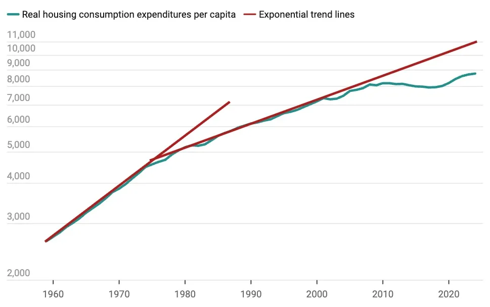
Source: US Bureau of Economic Analysis, Real personal consumption expenditures: Services: Housing and utilities: Housing (chain-type quantity index) [DHSGRA3A086NBEA, retrieved from FRED, Federal Reserve Bank of St. Louis (dataset), December 2, 2025, https://fred.st.louisfed.org/graph/?g=1vwZS.
The per-capita quantity of housing was not even keeping pace with the running trend in the years leading up to 2008, which is the period most commonly associated with claims of demand stimulus. There is a bit of an anomaly between figures 4 and 5. Why did housing consumption growth move below trend between 2000 and 2007 (figure 5) while residential investment was rising (figure 4)? One cause of this pattern was that the rise in residential investment during that time was moderate. Even in the peak year of 2005, net residential investment (shown in figure 4) was lower as a percentage of GDP than in all but a handful of pre-1980 years. Difficult supply conditions cause perceptions of increased demand to be inflated, so the small cyclical uptick in construction activity was associated with much more market upheaval than the construction activity of earlier decades when supply conditions were looser.
A second cause of consumption growth moving below trend while investment rose is that before 2008, inelastic supply conditions were regional. Closed Access cities[25] had almost perfectly inelastic supply conditions. In these cities, a moderate increase in demand for housing per capita increases rents, reduces regional population capacity, and creates regional displacement and a sizeable migration shift to other regions. A family displaced from Los Angeles might have moved into a unit renting for $1,000 in Phoenix that required more residential investment inputs than their $2,000 unit in Los Angeles. Supply conditions in the Closed Access cities became binding enough that the marginal additional residential investment occurred elsewhere. The rise in residential investment after 2000 was associated with increased migration from supply-constrained regions to other regions.
Inflated real estate prices result from rent inflation
Real and nominal rent trends strongly tie the current high value of American residential real estate to inadequate supply conditions. The next question is, How much have rising rents been associated with rising real estate prices? This section argues that rising rents are the primary drivers of inflated real estate prices.
The black line in figure 6 represents the ratio of total value of residential real estate to total US personal income, as also shown in figure 2. The other three measures in figure 6 show total value disaggregated into three components. The gray line represents the path total real estate value would have followed if real estate value had tracked the growth of real housing investments. The dashed orange line is rising value correlated with cumulative relative rent inflation since 1980.[26] The red line is the residual value (the black line minus the gray line and the orange line), which can be described as the cyclical component.
In the mid-2000s, prices were elevated because of both a short-term cyclical upturn (the red line was temporarily high) and long-term rent inflation (the dashed orange line was persistently rising). The combined attempts by the Federal Reserve to slow down construction in the 2000s and by federal mortgage regulators to limit access to capital for homebuyers after 2007 reversed the cyclical boom. Monetary and credit-related policies succeeded in lowering the ratio of nominal real estate value to income. They also caused the real portion of the ratio of real estate value to personal income to rise slightly from 2007 to 2010 in the only way that those policies could: by lowering incomes.
By 2012, total residential real estate had returned to about 1.6 times incomes, similar to the level common in the 1980s and 1990s. But that was a combination of (1) long-term rent inflation that had increased home values by nearly one year’s worth of income since 1980 and (2) a deep cyclical downturn that temporarily pushed home values down by roughly an equivalent amount from the cyclical peak. As a result of the policies that reversed the housing boom, residential investment declined even more. The decline in real housing and the associated rise in rent inflation accelerated. Rising aggregate nominal real estate values returned to their long-term uptrend after 2012, when the temporary negative cyclical impulse could not temporarily push values down any further. By 2023, nearly half of the total aggregate value of residential real estate was related to land rents that had been inflated by the inadequate investment in structures. Land values remain inflated because the quantity of residential structures has been suppressed.
There is one final point on the importance of demand versus supply: Most asserted sources of increased demand have been buyer subsidies (mortgage tax deduction and capital gains exemptions for homeowners, federal mortgage conduits, and others). Homebuyer subsidies increase demand for homeownership. Homeowners are both suppliers and demanders of housing, so homeowner subsidies can increase both supply and demand. From 1940 to 1970, New Deal homeownership programs took hold. Homeownership rose by 20 percentage points—an unrepeatable scale. Real housing consumption increased and rent inflation was low during that period. We have clear historical evidence of the effect of federal programs meant to stimulate homeownership. They were not associated with inflated values when they were significantly boosting homeownership.
All these trends suggest a limited role for changing demand in rising housing expenditures after the 1970s. Furthermore, the natural reaction of households to reduced supply is to lower real consumption of housing. In the mid-20th century, housing expenditures did not deviate far from about 8 or 9 percent of GDP.[27] The size, quantity, and quality of homes was improving over time, and in that context, total spending on housing tended to converge in that range. If input costs had risen during that period, or if productivity in construction had been stagnant, total spending on housing would not have increased more. By 1980, families instead would have lived in smaller, less valuable homes while spending a stable percentage of aggregate incomes on those homes.
Before the late 20th century, every city permitted enough new housing to make relatively affordable options available and to allow for the construction of better new homes as real incomes increased. The 59 percent increase in the aggregate price-to-income ratio from 1975 to 2023 was not just the result of marginally constrained supply. It was the result of supply so constrained that rising rents lowered the real incomes of some families so that they had to choose between regional displacement or a declining standard of living to stay in place.
The next section examines differences in housing scarcity among metropolitan areas. The two regimes in the Case–Shiller Index, from a long period of stability to the recent wild swings, find a parallel in cross-sectional comparisons. In regions where supply constraints only limit the rate of improvement, families adjust by consuming less. Where supply becomes so constrained that families must trade down to keep spending on housing stable, spending on housing rises.
2. Cost Differences Between Metropolitan Areas: How Filtering Up Reflects Economic Duress
At the metropolitan level, the inflation of real estate values reflects how housing scarcity plays out unevenly across regions. This section examines how differences in housing supply across US metropolitan areas have produced diverging price-to-income ratios. Real estate values are inflated where homes “filter up,” that is, where new residents of existing homes tend to have higher incomes than the previous residents. This dynamic arises when too few new homes are built.
When adequate new housing is built, existing homes become more affordable, and their new tenants over time tend to have relatively lower incomes than the previous tenants had. When supply is constrained, however, rising demand for housing (from population growth, income growth, mortgage access, and other factors) bleeds out into the existing stock. Rising home values are associated with an existing stock of homes that filters up to new residents with higher incomes instead of becoming a source of affordable housing for residents with lower incomes. The rise in costs and valuations is the most severe in ZIP codes with lower-income populations, and these neighborhoods are most prone to the effects of upward filtering. The tradeoffs of giving up neighborhood amenities (or accepting neighborhood disamenities like high crime) or of leaving the region entirely, in order to keep total spending at a manageable level, fall more heavily on families of lesser means. The high average housing costs in the most expensive metropolitan areas primarily reflect the rising costs of the neighborhoods where the poorest residents live. This metropolitan-level pattern confirms the importance of the lack of supply in rising housing costs.
Recent empirical research confirms these dynamics. Economists Liyi Liu, Douglas A. McManus, and Elias Yannopoulos have updated the evidence of variations in rates of filtering across US metropolitan areas (MSAs). They report that homes have typically filtered down by about 0.7 percent annually. In other words, on average, if a family sells its home after 10 years, the new buyers will have an income about 7 percent lower than the sellers. If the family sells its home after 20 years, on average, the new buyers will have an income about 13 percent lower than the sellers, and so on. However, Liu et al. also identify conditions under which this traditional pattern reverses. They find that upward filtering is correlated with rising home prices, inelastic supply, and regulatory burdens on new construction.[28]
As discussed in section 1, the aggregate price-to-income ratio has risen sharply over recent decades. Revisiting figure 2 helps illustrate how this phenomenon operates at the metropolitan level. The two measures—the real Case–Shiller Index and the total value of all homes relative to incomes—moved roughly in line with each other from World War II to the turn of the century, but they have diverged sharply since 2008. The divergence helps to illustrate the dynamics underlying the inflation of real estate values relative to incomes. The ratio of the value of residential real estate over personal income is a snapshot in time. The housing stock changes over time, so the composition of what is measured changes over time. The real Case–Shiller Index intends to measure the changing value of a stable set of existing homes over time, and it is traditionally deflated with the general level of the consumer price index.
The two measures are quite different, but there is good reason for them to follow parallel trends, as they did from 1946 until the late 1990s. (Here, it is useful to think of prices moving in proportion to rental value.) Imagine a typical year with 2 percent inflation and 2 percent growth in real incomes. In a market where supply is not especially constrained, and where per capita housing consumption is stable over time, expenditures on housing should also grow by 4 percent (2 percent inflation plus 2 percent real). The 2 percent real growth will come in the form of new or renovated homes. So, the following year, total nominal incomes will be 4 percent higher, and the total rental value of all homes will be 4 percent higher. The ratio of home values to incomes will remain the same because the numerator and denominator will both rise by 4 percent. Existing homes that are marginally maintained will be 2 percent more valuable due to inflation, so the real Case–Shiller Index, measuring the value of existing homes after adjusting for 2 percent inflation, will also be the same as it was the previous year.
Now imagine the same context, but no new homes are built. If general inflation is 2 percent, real incomes rise by 2 percent, and spending on housing is stable as a portion of incomes, families will spend 4 percent more for the same homes. The price-to-income ratio of the stock of homes will remain stable. (The ratio would have a 4 percent higher rental value in the numerator and a 4 percent higher income in the denominator.) The real Case–Shiller Index will rise (4 percent rent inflation in the numerator and 2 percent general inflation in the denominator). In fact, regardless of how high inflation is, the real Case–Shiller Index will rise by 2 percent more than the home value-to-income index because real incomes increased by 2 percent more than the real housing stock did.
One might imagine this going in the other direction too. In a building boom, if the real housing stock increased by 4 percent, all else equal, the real Case–Shiller Index would decline by 2 percent compared to the home values-to-income index.
The real Case–Shiller Index is moving higher than the (real estate value-to-income) value because the lack of adequate new homes has increased the rent inflation on existing homes. In fact, if the Case–Shiller Index is deflated using rent inflation instead of general inflation, the deviation between the measures is much smaller.[29]
Filtering and home values
To further analyze the central role of upward filtering in inflated real estate prices in US housing markets, figures 7 to 15 will use an additional measure: ZIP-code-level data combining Zillow’s median home value estimates (ZHVI) for 12,153 ZIP codes with IRS measures of average adjusted gross income (AGI) for those ZIP codes from 1999 to 2022.[30]
Liu et al. estimated the average filtering rate of existing homes in each metropolitan area over a 45-year period from 1973 to 2018.[31] Figure 7 compares the aggregate price-to-income level for 75 metropolitan areas to their filtering rate. Metropolitan areas are sorted into two groups, with roughly equal populations: those with filter-up estimates and those with filter down. Filter-up areas are places like Los Angeles, where new residents with higher incomes move into existing homes, and filter-down areas are places like Atlanta, where the rate of homebuilding has generally been higher, and households with lower incomes have moved into existing neighborhoods as homes age.
Figure 7 compares metropolitan areas by highlighting the interaction between home prices and filtering rates. When filtering is downward, there is little variation in price-to-income ratios. Supply is elastic enough that housing expenditures and prices are driven by demand elasticities and construction costs. Near-unitary income elasticity of demand means that where additional supply is available, quantity demanded will increase over time to keep total expenditures at a relatively stable portion of incomes.[32] The long-term stability of the Case–Shiller Index and historical price-to-income estimates themselves implies such a state. Where supply is elastic there is also less variance in price-to-income levels between areas within metropolitan areas, discussed below.[33]
FIGURE 7. Filtering and home values, 1973–2018
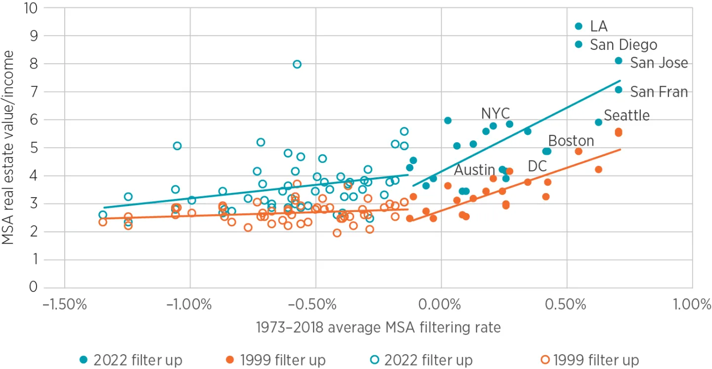
Source: See footnote 30.
The correlation between filtering rates and price-to-income levels is not linear. There appears to be a tipping point at a filtering rate near zero, below which price-to-income levels are only weakly related to relative filtering rates, and above which they are positively correlated. Where filtering is upward, price-to-income levels are positively correlated with filtering rates. The higher the filtering rate, the higher the average price-to-income is. If home values were rising because incomes were rising, they should rise proportionately with incomes (as they do in cities where homes filter down), rather than rising significantly more than incomes. Until recent decades, cities with marginally higher incomes grew, and existing homes filtered down. That kept both incomes and home prices from deviating significantly from the norm. Austin is the best example of a city where homes are filtering up because of local income growth rather than because of housing constraints. Liu et al. estimate an annual upward filtering rate of 0.25 percent for Austin, but in 2022, the aggregate price-to-income ratio in Austin was relatively low at 4.2 times. It is well below the regression line for upward filtering cities, and it would also be below the regression line for downward filtering ones.
This relationship becomes even clearer when comparing groups of metropolitan areas over time. Figure 8 compares the aggregate price-to-income ratio in the filter-down metropolitan areas and the filter-up metropolitan areas from 1999 to 2022. Dividing the data into two sets shows dramatically more variance in 2005 than in 1999. In fact, a similar analysis in 1970 could not have produced a similar dichotomy. The large variance between metropolitan areas’ incomes and home prices is a relatively recent development.[34] When the Case–Shiller Index was stable for a century, it was not because all the metropolitan areas included in figure 7 had price-to-income ratios one point lower. It was because all metropolitan areas were in the filter-down group, so that, no matter how well the local economy was doing, the price-to-income ratio in all metropolitan areas had a strong reversion to a mean value near about 3 times local incomes.[35]
There was a mixture of cyclical price appreciation and supply constraints from 1999 to 2005, and the cyclical elements subsequently reversed. The price appreciation was very focused on the upwardly filtering cities, however, and that diversion never significantly reversed. In 1999, the aggregate price-to-income ratio in the upwardly filtering metropolitan areas was about 4 times income, while it was just under 3 times income in the downwardly filtering metropolitan areas. The average home took an extra year’s income in the upwardly filtering metropolitan areas in 1999. Since 2003, the average home in upwardly filtering metropolitan areas has generally taken at least 2 extra years’ income compared to the downwardly filtering metropolitan areas.
The stable difference between the two sets of metropolitan areas since 2008, unfortunately, appears to reflect a shift to upward filtering in most cities. Liu et al. find tentative evidence that filtering, which traditionally has been downward, has moderated or reversed in recent years. This finding is confirmed in other recent research by Dowell Myers and Jung Ho Park.[36] Jonathan Spader of the Federal Housing Finance Agency also found that since 2015, the historical norm of downward filtering has reversed and housing has been filtering upward generally across the country.[37]
Price-to-income levels in individual metropolitan areas might provide a real-time estimate of filtering rates. If we assume a fixed correlation between filtering and housing costs, the rise to higher price-to-income levels from 1999 to 2022 in figure 8 actually reflects a rightward move to higher filtering rates between 1999 and 2022.
It should not be surprising that filtering has shifted upward. The metropolitan areas with the most positive filtering tend to have lower rates of housing production. Between 1994 and 2005, the median number of housing permits issued annually per 1,000 residents in upward-filtering cities was 5.5 units, compared with 7.6 in downward-filtering cities. The most constrained metros—New York, Los Angeles, Boston, San Francisco, and San Jose—were all below 4. From 2006 to 2018, median permitting rates of upward and downward filtering cities fell to 2.9 and 3.9 units, respectively. The rate of new housing permitted in the entire set of cities since 2006 has been less than the rate of housing permitted in upward-filtering cities before 2006.
In short, the persistence of high price-to-income ratios across most metropolitan areas since 2008 reflects a nationwide shift toward upward filtering. This signals a chronic housing undersupply deep enough to tip typical families from a context of improving housing conditions, not just to slower growth, but into a context of decisions framed by backsliding and displacement.
Section 3 examines more closely how the differences between metropolitan areas are largely driven by rising costs among each region’s poorest residents. Housing scarcity and filtering shape cost differences across neighborhoods and income groups. Much of the inflation in real estate values arises from regressive rent pressures within cities rather than from differences between them.
3. Cost Differences Within Metropolitan Areas: How Housing Scarcity Creates Regressive Rent Inflation
Nearly all inflated real estate value is from regressive rent inflation, a pattern in which rents rise fastest for households with the lowest incomes and the fewest housing alternatives. Where homes filter up, their rents and prices rise faster than their residents’ income. This regressive dynamic directly links local housing scarcity to household-level financial strain. Rising housing costs reflect the inertia of families who are willing to pay more to remain in place because moving or being regionally displaced is difficult. Earlier research found that upward filtering is associated with domestic outmigration, especially among locals with lower incomes.[38] As housing becomes scarce, some families are displaced, while those who remain bid up rents until additional households finally give up and move away. Upward filtering is not significantly associated with domestic in-migration.
This regressive dynamic can be understood by contrasting regions where housing supply is elastic, allowing homes to filter down naturally, with those where scarcity drives prices upward faster than incomes. Where supply is ample, homes depreciate faster than they filter down. Homes physically filter downward in all contexts. When filtering was reliably downward, price-to-income ratios were stable over many dimensions—over time, across cities, and across incomes within cities. That is not a cosmic coincidence. Housing structures naturally lose value and need to be maintained and updated. So, where the number of units is adequate for the regional population, the portion of residential investment applied to upgrades of the existing stock of homes naturally is the portion that comfortably matches the homes to the incomes of the region’s residents.
On the other hand, where homes are filtering upward, the inflation of land value outpaces the depreciation of structures. Some cities with upward filtering might have higher than average demand, requiring above-average growth to keep housing costs stable. But, on average, the cities with upward filtering do not have significantly higher demand than average cities. The outmigration they create is not, on average, due to high migration churn (more families moving in, requiring more families to move out). It is mostly related simply to lower rates of new housing construction and higher out-migration.[39]
One could say that the high price of the average home in cities where homes are filtering up is determined by the costs that the marginal remaining families are willing to pay in order not to be displaced from the city.
These supply-driven filtering mechanisms are visible in long-term national data. Figure 9 compares the real Case–Shiller Index and the Federal Reserve real estate valuation/BEA personal income measure from figure 2 to a third measure: the Zillow ZHVI/IRS AGI measure that was used in figures 7 and 8.
As with the measure of the Federal Reserve’s estimate of home values over the BEA’s estimate of personal income, the Zillow/IRS measure is a snapshot. It is the aggregate total of average incomes and home values from 12,153 ZIP codes at any point in time.[40] All measures in figure 9 have been adjusted with a constant to be equal to the ZHVI/AGI measure in 1999—the first year that estimate is available.[41]
Since the Zillow data can be disaggregated and analyzed more closely, the reasons for the shift to higher price levels can be considered with more detail. And one can presume that, as with the other two measures, before 1999 there was much less variation in the Zillow estimate than there has been since 1999. In other words, the ZHVI/AGI estimate in 1950, 1960, 1970, and 1980 was likely strongly mean reverting to approximately three times the average income or slightly more.
The recent volatility in these national averages results from deep disparities within metropolitan areas themselves. Across metropolitan areas, the outlier expensive metropolitan areas have been the source of rising aggregate real estate values. But, within those metropolitan areas, ZIP codes with the highest incomes continue to revert to a stable long-term mean valuation. The rise in property values is mostly from the poorer ZIP codes in the expensive metropolitan areas.
Figure 10 illustrates the stark shift from 20th-century norms, where price-to-income ratios were similar across incomes in most cities, to the current context where ZIP code income is the single more important determinant of price-to-income ratios in most cities. These examples show how differences in local supply shape the stress of high housing costs across incomes within cities, and how costs are as high in Atlanta and Phoenix today as they were in Los Angeles in 1999.
Earlier research showed that in MSAs with ample housing, the price-to-income ratio tends to be relatively similar across the region. Price-to-income levels take on a log-linear pattern across a supply-constrained MSA. The slope of that line (the difference in price-to-income ratios associated with a one-point difference in log income) can be used as a proxy for local supply conditions. It is correlated with measured rates of filtering and outmigration.[42] In fact, the average price-to-income ratio of each filter-up city in figure 7 is really an average of homes in ZIP codes with high incomes where price-to-income ratios remain relatively stable and homes in ZIP codes with low incomes where price-to-income ratios rise to levels much higher than the city average.
The tendency to continue spending a stable portion of incomes on housing is the reason why the Case–Shiller Index in figure 2 was so flat for so long. Families changed the real characteristics of their homes over time from 1890 to the late 20th century to keep spending stable. The sudden spike of housing costs and home prices away from that long-term norm is not a sign of marginally constrained supply. It is a sign of supply so constrained that many families are unable to compromise on the characteristics of their housing fast enough to counteract rising rents. Families with more income and more choices are still able to do that. Families with lower incomes and fewer choices in cities with short supply are not.
Moving is difficult or costly, so families cannot easily keep moving sequentially as rents rise. The scale of that friction can be seen clearly by observing the hundreds of thousands of residents who move out of the most expensive cities each year. They typically spend much less on the new homes they move into in other cities. The difference between the cost of their old and new homes is the scale at which families will put up with rising housing costs when the alternative is displacement.
When there are no acceptable housing alternatives within their home region, many families are willing to pay a very high premium to stay in their homes. But hundreds of thousands of families reach a limit each year where they are willing to give up their home cities to get back to that normal level of spending. Families naturally sort into leavers, who choose displacement to return to the historically normal level of housing costs, and remainers, who are willing to put up with less income after housing costs to avoid displacement.
Figure 10 compares ZIP codes across Los Angeles, Phoenix, and Atlanta, in 1999 and 2022. Over the course of the 45 years estimated by Liu et al., Los Angeles had upward filtering, Phoenix had average filtering, and Atlanta had downward filtering. In an earlier study, each metropolitan area is assigned a slope based on the log-linear pattern against incomes.[43] In 1999, the slopes shown in figure 10 are -0.3, -0.2, and -1.8 in Atlanta, Phoenix, and Los Angeles, respectively. In other words, in Los Angeles, each 1-point increase in log income across ZIP codes was associated with a typical price-to-income ratio 1.8 points lower.
FIGURE 10. Zip-code comparisons across Los Angeles, Phoenix, and Atlanta, 1999 and 2022
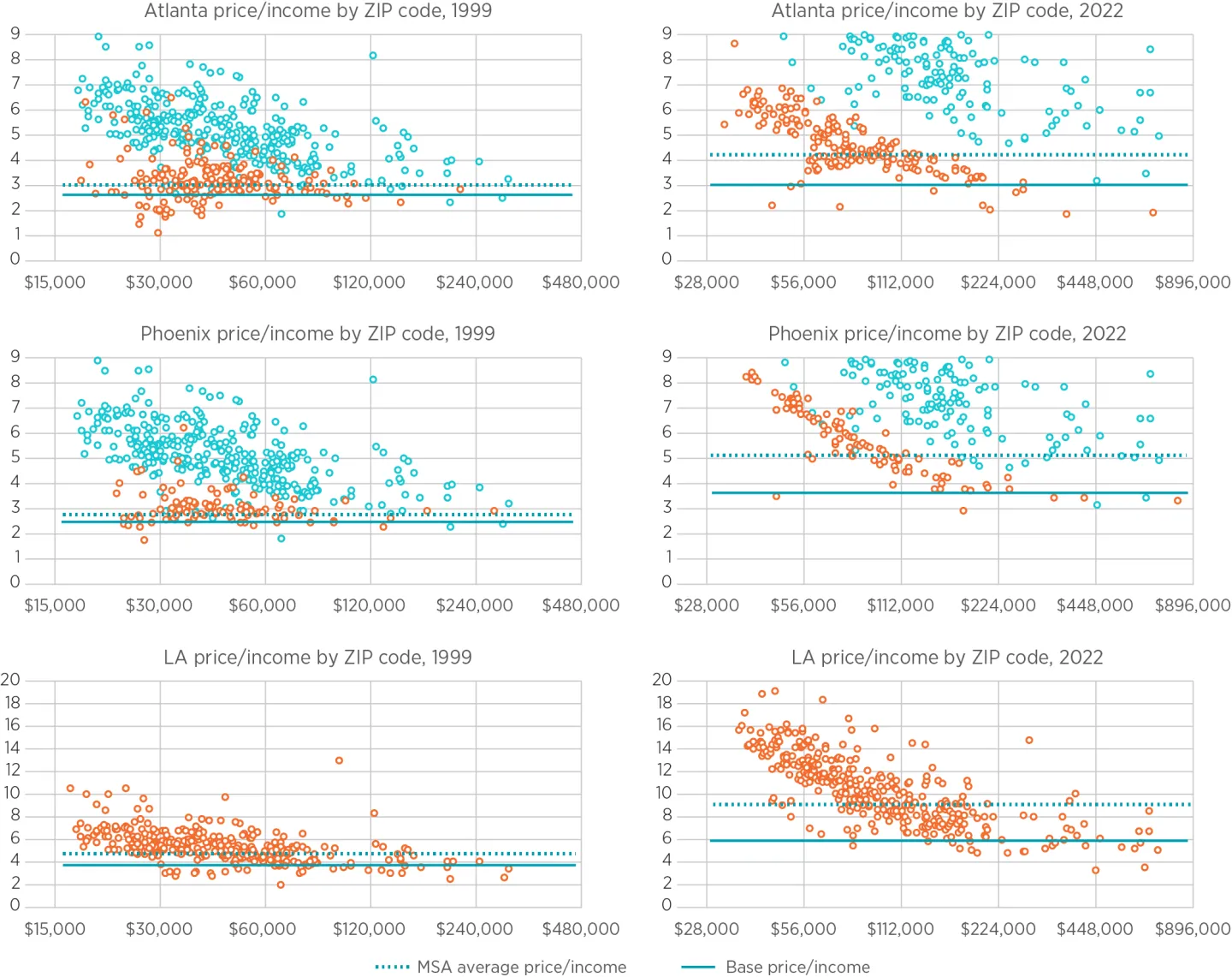
Source: See footnote 30.
Note: The blue plots in the Atlanta and Phoenix charts represent Los Angeles ZIP codes, shown to demonstrate the difference in scale.
In 2022, the slopes were -1.9, -2.7, and -4.9. At very high incomes, price-to-income levels tend to asymptote to a base level, so those slopes exclude the richest 10 percent of ZIP codes. In order to relate these patterns to aggregate real estate values and to include smaller metropolitan areas that may not have enough ZIP codes to estimate a reliable linear slope, the following analysis estimates a base price-to-income level (the average price-to-income of the ZIP codes with the highest incomes) and the additional aggregate real estate value associated with ZIP codes with higher price-to-income levels. In figure 10 the solid horizontal line is the base price-to-income level for each MSA year, and the dotted horizontal line is the value-weighted average price-to-income level for each MSA year. The difference between the two is the extra real estate value associated with the higher price-to-income levels in the ZIP codes with lower incomes.
Since the inflation of price-to-incomes in Los Angeles is of a much greater scale than in Phoenix and Atlanta, the scales of Phoenix and Atlanta are adjusted down and include a shadow plot of Los Angeles ZIP codes in those panels for comparison. In the 2022 panels, price-to-income ratios in Los Angeles are mostly outside the scale of the Phoenix and Atlanta panels.
In 1999, in most metropolitan areas price-to-income ratios were not very strongly associated with incomes. In Atlanta and Phoenix, families sorted across the stock of housing in a way that generally matched with different incomes. At each income level, families sorted further among ZIP codes based on idiosyncratic differences between ZIP codes, such as commuting time and local amenities. By 2022, income was the dominant factor determining price-to-income ratios. Cost now dominates housing and migration decisions.
Those downward-sloping plots are the result of upward filtering. More specifically, they are the result of inertia in the face of upward filtering. Homeowners are insulated from rising housing costs, and renters do not move immediately as costs rise. Especially if rising costs require regional displacement—moving out of the metropolitan area entirely—some families are willing to pay exorbitant costs to remain. Price-to-income levels in Los Angeles are now routinely in the teens in ZIP codes with average incomes below $50,000 because families unwilling to pay those costs self-selected to move away—by the millions. The only lower-income families that remain in Los Angeles are either insulated from exceedingly high housing costs or are willing to pay them. These downward slopes are not an equilibrium condition. They are a disequilibrium. They are the result of inertia in family housing decisions under duress.
Before 1999, national aggregate price-to-income levels never deviated far from the base levels. The negatively sloped price-to-income relationship is recent and novel. It appeared first, cross-sectionally, in metropolitan areas like Los Angeles where annual new permits were very low, and housing was filtering up. Then, it appeared more broadly as housing construction declined to unprecedented lows across the country and housing began filtering up across the country.[44]
Think of these downward-sloping price-to-income plots as a measure of market frictions. These areas have the potential for upward filtering. Costs have risen but the homes have not fully filtered up to new owners with higher incomes. If families were not connected to the idiosyncratic endowments of their existing homes, neighborhoods, and cities, the price-to-income plots would not develop these downward slopes. As soon as costs rose slightly, some families would have moved, and their home would have filtered up to a family with higher income.
Some literature, in the parlance of economists, suggests that “population elasticity” is high, meaning that families moving into a city have a similar motivation as families moving out of a city, and that families move away from cities with relative ease when housing supply is inadequate. The large difference between the prices of homes in poor neighborhoods versus rich neighborhoods suggests otherwise. [45]
Another widely cited concept in the economics academy is spatial equilibrium. In a nutshell, this means that some cities may be more expensive, but households will move there in spite of higher costs because those cities offer better job opportunities and amenities. This is an important concept and was probably one of the most important factors determining migration patterns in the 20th century when price-to-income ratios were in the low-single digits in most ZIP codes. When housing supply was adequate, prices increased moderately in growing regions.[46] Today, prices have increased by multiples in regions where growth has slowed.
Spatial equilibrium requires a market with few enough frictions so that households can move based on tradeable preferences. Spatial equilibrium explains the existence of cities, but today frictions dominate, and the primary friction is the unwillingness of families to be displaced from housing that is filtering up underneath them.
Several of the metropolitan areas with the highest upward filtering rates now regularly lose population. According to the BEA, the Los Angeles metropolitan area has averaged about 0.7 percent population loss annually since 2017.[47] It seems unlikely that the geographical capacity of Los Angeles is declining by about 0.7 percent annually. But, in any case, the point remains: Los Angeles housing valuations are related to the acquiescence to higher costs of the families who have chosen those costs over displacement in a city with shrinking capacity. The high cost of housing in Los Angeles is a signal of a novel form of poverty. It is the cost accepted by the remainers who have chosen not to be one of the millions of former residents who moved away.[48] Average local incomes have risen, in large part, because poor families have moved away. In the amply housed 20th century that was reasonably described by spatial equilibrium and aspirational migration decisions, average local incomes rose because of families moving in.
In this way, supply constraints can raise local average incomes even where agglomeration economies and productivity are average or worse. We cannot assume that higher incomes are entirely the result of urban productivity, especially when the cities with expensive homes and high average incomes are now routinely shrinking, and their compositions are being changed as much by the characteristics of the families that are leaving as by those that arrive.
When upward filtering spread to other regions after 2008, it coincided with lower population growth, less housing construction, lower rates of migration into growing cities, and higher rates of outmigration from expensive cities. Both cross-sectionally and over long periods of time, high rents are correlated with lower housing production.[49]
Figures 11 through 14 extend this analysis by decomposing national housing values into base and extra components, distinguishing between filter-up and filter-down metropolitan areas. Figure 11 divides the aggregate national data set into the base price-to-income value common across each individual MSA and the extra value associated with higher price-to-income levels in ZIP codes with low incomes. (Basically, “base value” is the value of homes in every ZIP code if price-to-income levels were equal to the richest ZIP codes in each metropolitan area—the solid blue lines in figure 10. The difference between the total value of homes and the “base value” is labelled as “extra value.” This is the difference between the dashed blue lines in figure 10 and the solid blue lines.) ZIP codes that are not in metropolitan areas large enough to determine a base value and extra value are labeled “rural.”
Both base value and extra value inflated between 1999 and 2005. There was a lot going on in 2005. An earlier study laid out a model for assessing the causes of cyclically high home prices from 2002 to 2006.[50] The character of the market has simplified greatly since then. The cyclical impulse moderated, and mortgage access was curtailed significantly.
In 2022, the aggregate price-to-income level was about 1.6 points higher than it was in 1999, and about half of that was due to the extra value associated with upward filtering. Changes in incomes and inflation related to COVID have created some noise in these measures, so precise estimates in recent years are difficult. For instance, using 2021 data, nearly all the rise in real estate value since 1999 is from the extra value measure.
Figure 12 further splits the base value and extra value data into the up- and down-filtering halves. In the filter-up metropolitan areas, the base value was 2.9 times incomes in 1999 and 3.8 times incomes in 2022. Extra value added 0.9 points to aggregate price-to-income in 1999 and 2.0 points in 2022.
In the filter-down metropolitan areas, the base value was 2.4 times incomes in 1999 and 2.8 times in 2022. The extra value added 0.3 times in 1999 and 1.0 times in 2022.
Figure 13 shows how much of aggregate valuations is attributable to base value and extra value in filter-up and filter-down metropolitan areas since 1999. (Here, the rural areas have been removed to clarify the roles of these two elements of changing valuations.) Metropolitan real estate price-to-income has risen by about 1.6 times. Of that, 1.1 times is from filter-up cities—0.5 times from rising base value and 0.6 times from extra value. About 0.4 is from filter-down cities—0.1 from base value and 0.3 from extra value.
Finally, figure 14 sets the real Case–Shiller Index equal to the Zillow/IRS price-to-income estimate in 1999. It also shows the Zillow/IRS price-to-income estimate including only rural and base value. The rural and base value level roughly lines up with the lowest level of the Case–Shiller Index in the post–World War II period.
In 1999, extra value in metropolitan areas with downward filtering was only 0.3 points. In metropolitan areas with upward filtering, it was 0.9 points. It is plausible that in 1999, upward filtering was already mildly inflating aggregate real estate values. Zillow’s current methodology to estimate typical home values within ZIP codes only dates to 2000,[51] so trends before then must be inferred. The small portion of the rise in aggregate home values that occurred before 1999 is also plausibly attributable to upward filtering.
From 1999 to 2005, home prices increased because of both urban supply constraints and a demand boom. Both base value and extra value increased during those years. Base value declined after 2005, but extra value has persisted in the filter-up cities and has started to appear in filter-down cities. The housing boom of the 2000s was a distraction from the more persistent supply shortage, and as it recedes into the past, the importance of the supply shortage becomes increasingly clear.[52] The preceding decomposition shows how scarcity inflates aggregate market value, but it does not capture how individual households experience these changes.
Value-weighted averages vs. equal-weighted averages
Since this recent divergence to higher valuations is concentrated among the ZIP codes with the lowest incomes and the lowest home prices, housing costs have risen more for most families than the value-weighted averages.
An extreme example can help to illustrate this. Imagine a family with $1 million income and a family with $40,000 income, and both live in homes worth three times their incomes. The value-weighted average price-to-income is 3 times ($3,120,000/$1,040,000). If the home of the poor family doubles in value, then the aggregate value-weighted average price-to-income rises to 3.1 times ($3,240,000/$1,040,000). If the home of the rich family doubles in value, then the aggregate value-weighted price-to-income is 5.9 times ($6,120,000/$1,040,000). In both cases, one of the two families experiences a doubling in price-to-income, but that doubling only significantly affects the aggregate number when it happens to the rich family.
In the above example, averaging the price-to-income ratio of each family statistically conveys the average experience of the two families. In both cases, the average price-to-income rises from 3 to 4.5 times [(3+6)/2]. The value-weighted measure expresses information about the total marketplace. The equal-weighted measure expresses information about the experience of the average household.
The income-sensitive valuation deviations described above, then, systematically understate the deviation in home values experienced by the average American household. This is clear with a cursory view of figure 10. In all three cities, most ZIP codes have experienced increases in price-to-income much greater than the city average and now have price-to-income levels higher than the city average—some much higher. An equal-weighted estimate can clarify the importance of filtering in the typical household’s financial state of affairs.
Figure 15 compares the value-weighted and equal-weighted average price-to-income levels over time for the United States and for the filter-up and filter-down cities.[53] The average price-to-income ratio of American homes (value-weighted average) increased 40 percent from 1999 to 2022. The price-to-income ratio of the average American family increased 56 percent. In the filter-up cities, homes increased by 52 percent in the aggregate, but the increase experienced by the average family was 67 percent.
Rising housing costs are lowering real incomes of the poorest households
Since home prices are more affected by cyclical changes and credit access, rents can offer a clearer view of the persistent trends in affordability. Furthermore, price levels likely understate the inflated value of homes since 2008 because much tighter mortgage access has had a depressing effect on low-tier home values.
Zillow.com publishes rent estimates for ZIP codes for the years 2015 and after. The trends in prices are highly correlated with trends in rents, cross-sectionally within metropolitan areas, across metropolitan areas, and over time.[54] From 2015 to 2022, in the richest quintile of ZIP codes, rents have risen in proportion to incomes.[55] In the poorest quintile, rents increased faster than incomes (figure 16). Rising rents reduced real income growth in the lowest income quintile by about 15 percent relative to the highest income quintile. That is a 2 percent annual divergence in disposable incomes after rent—enough to erase all other sources of real income growth for the poorest families.[56]
This must be one of the most important current factors driving public sentiment about economic growth and equity. In fact, new research is increasingly finding that a lack of adequate urban housing is a primary motivator for many of the recent challenges in the American economy.[57] Economists Rebecca Diamond and Enrico Moretti find:
(F)or college graduates, there is no relationship between consumption and local prices, suggesting that college graduates living in cities with high costs of living—including the most expensive coastal cities—enjoy a standard of living on average similar to college graduates with the same observable characteristics living in cities with low cost of living—including the least expensive Rust Belt cities. By contrast, we find a significant negative relationship between consumption and local prices for high school graduates and high school drop-outs, indicating that expensive cities offer lower standard of living than more affordable cities.[58]
The Diamond and Moretti findings concur: High real estate values reflect relative poverty. And, at this point in American trends, on net, that is all they reflect. High housing costs have been claiming all the urban productivity benefits of high-skill workers and more than all the urban productivity benefits of low-skill workers. The lower real living standards that Diamond and Moretti found are only the costs of the families that remain in the underhoused cities. The costs imposed on the millions of displaced and homeless families are more difficult to measure.
4. Why Is This Important?
Lagging residential investment is inflating land values and rents paid by the least prosperous families. Yet alternative explanations for the high prices defy aspects of this mechanism: Cyclical explanations presume prices have increased despite stagnant rents. Explanations based on federal stimulus or low interest rates assume that high values reflect increased investment. Explanations focused on the special worth of expensive cities presume that prices are rising in the most prosperous neighborhoods.
Policy responses and analytical frameworks have reflected these incorrect presumptions. The core question—why home prices have risen so sharply and what mechanisms are actually driving the increase—can be separated into three parts:
- Are home prices elevated because of elevated rents or in spite of flat rents?
- Are high rents driven by cost of structures or cost of land?
- If rising land values are the cause, do they reflect aspirational demand for positional goods or competition or scarcity reinforced by credit constraints?
Each of these parts is discussed below.
Rents: Are home prices rising because rents are rising?
The Financial Crisis Inquiry Commission (FCIC) provides an example of the erroneous presumption that rising prices are unrelated to rising rents. In its 2011 report the commission represented the collected wisdom of experts on economics and finance when it reported on the causes of the 2008 financial crisis. It concluded that the 2008 crisis had been avoidable, but not because housing construction should have been recovering by 2007 or 2008. Instead, it concluded that housing and financial markets had been too active and reckless in the years prior.
The report states, “American economists and policy makers struggled to explain the house price increases.... (H)ome prices had risen from 20 times the annual cost of renting to 25 times. In some cities, the change was particularly dramatic. From 1997 to 2006, the ratio of house prices to rents rose in Los Angeles, Miami, and New York City by 147%, 121%, and 98%, respectively.” The cities cited as examples of sharply rising price-to-rent ratios were, in fact, cities where rents had risen the most.[59] From 1999 to 2006, on average in the US, excess rent inflation accumulated by about 6% more than prices in other categories. In Los Angeles, Miami, and New York City, excess rents grew by 22%, 15%, and 14%, respectively.[60] The index of the FCIC report does not even include an entry for “Rent.”[61]
There was, clearly, cyclical activity before 2008. But by treating the issue as a binary question and failing to place cyclical activity in the broader context of persistently rising rents, the commission—and federal officials drawing similar conclusions—adopted disastrously contractionary positions toward housing and homebuying demand. The financial crisis was avoidable: Policymakers should have recognized the importance of rising rents and refrained from contracting buyers’ demand so sharply.[62]
Structures vs. land and positional goods vs. necessities
The next issue is whether rising rents reflect structure costs or land values, and whether rising land values arise from positional demand or scarcity. In a 2015 paper, economist Joseph Stiglitz echoes the premise motivating this research paper’s analysis. He notes, “A significant amount of the increase in the wealth–income ratio in recent decades is due to an increase in the value of land,” and concludes that “wealth, as conventionally measured, may increase, even as the real wealth of the economy diminishes.”[63]
Stiglitz considers two demand-side sources of rising land values: (1) demand for locations as positional goods and (2) credit markets, which can create positive feedback loops into assets that can be then used as collateral for more credit, which can increase the demand for the assets further. This can operate in the short term through asset bubbles or in the long term through rising land rents.
Demand for locations
Stiglitz interprets high land rents as the result of cities acting as positional goods. He states, “If land serves as a positional good, there can be an increase in the value of land, without any increase in the productive potential of the economy. Rich individuals compete for houses in the Riviera. As the rich get richer, they compete more vigorously for this real estate, and the price of this fixed asset increases, without any increase in ‘real’ output.” He also mentions Southampton, Long Island as another example.
Elsewhere, Stiglitz states, “As population increases, the scarcity value of particularly attractive sites (like land in the Riviera) becomes greater. Much of the value of land today is in urban areas; as the population in key urban centers increases, the value of land in these cities increases.”[64]
These statements seem intuitively plausible, but urban land values have been rising in metropolitan areas with slowing growth or declining populations. Within expensive cities, price appreciation has been negatively correlated with neighborhood amenities and local incomes. The Rivieras have not become more expensive; rather, it is the least positionally valued neighborhoods that have appreciated the most.
Stiglitz is utilizing the logic of spatial equilibrium models here. At the local level, spatial equilibrium models would predict that, say, neighborhoods with good schools, rich neighbors, or convenient locations naturally are more expensive. They are. But, in the era of rising housing costs, those neighborhoods have become much less expensive relative to less desirable neighborhoods.
Stiglitz implicitly assumes that the high incomes in metropolitan areas reflect unusually large inflows of wealthy and productive residents. In reality, they often reflect unusually high outflows of poorer residents.
In short, rising land values in expensive metropolitan areas are not evidence of intensified bidding for luxury urban locations. They are evidence of widespread housing scarcity that forces households to compete for basic shelter or local endowments like proximity to family and long-developed personal connections, especially in neighborhoods with historically modest demand and limited alternatives.
Credit feedback
Having considered the positional-goods hypothesis, we now turn to a second demand-side explanation for rising land values: the claim that credit-market feedback, rather than supply scarcity, is the primary driver of rising rents and prices. According to this view, rising asset values enable additional borrowing against collateral, which in turn fuels further increases in demand and prices. Joseph Stiglitz articulates this argument most notably, suggesting that modern credit systems can create positive feedback loops that inflate land values and amplify wealth inequality.
Stiglitz develops this argument by emphasizing how credit markets allocate borrowing power across households. He argues that modern credit markets can amplify inequality by expanding lending to wealthy households based on collateral values while drawing poorer households into unsustainable borrowing at high interest rates. He writes, “If access to credit is based on collateral; and if the assets which have benefited from the increase in credit (or other changes in the financial system) are disproportionately owned by the rich, then it should be apparent that these increases in credit and other changes in the financial system may have played a major role in the increase in wealth and income inequality. Our system of credit creation may perversely create not only inequality at the top, but also at the bottom. It persuades the poor to borrow beyond their ability and then charges them usurious interest rates.”[65]
However, the timing of credit-market developments contradicts the mechanism Stiglitz describes. His paper was published after a drastic permanent decline in mortgage access. The contraction in prime-level mortgage lending was steep and immediate. About two-thirds of Fannie Mae’s late-20th-century lending went to borrowers with credit scores below 740. The lending share dropped to about one-third between 2008 and 2009 (a change unrelated to, and occurring well after, the private subprime mortgage markets collapsed) and never recovered. Lending activity tracked by the New York Federal Reserve in broader markets showed similar patterns.[66]
The drop in lending, however, did not stop the long-term trend of rising rents and prices. Across every dimension—over time, across metropolitan areas, and within metropolitan areas—residential construction has declined the most where mortgage access has been most constrained. Rents have risen most steeply where home prices fell the most after the mortgage crackdown. The years with much more stringent mortgage access have been associated with greater income inequality, because of rising rents in neighborhoods that lost access to mortgages.[67]
Stiglitz recommends further limiting access to credit. Since 2022, record-high levels in the real Case–Shiller home price index have coincided with the lowest leverage on residential homes since 1960.[68] Numerous papers reach similar conclusions without acknowledging the post-2008 change in lending standards and mortgage originations, with apparently no objection from reviewers and editors. There appears to be little appreciation for, or concern about, the decline in mortgage access in academic discussions about recent housing trends.
Stiglitz asked the right question: Is housing wealth, as currently measured, really a reflection of greater wealth? And he had the right answer: It is not. But a closer look at the evidence, as laid out in the sections above, suggests that the mechanisms producing this outcome are not those he emphasized.
His conclusions seem to have led him to turn away from his earlier writings on credit. Earlier work from Stiglitz had concluded that information asymmetries lead banks to ration credit too tightly.[69] In a recent interview, Tyler Cowen asked Stiglitz about this. Discussing the housing bubble before 2008, Cowen asked, “Do you think that since then, the real problem has more often been that we’ve thrown too much credit at things?” Stiglitz responded, “The issue here was that we weren’t very good at credit allocation and that we thought, let the market rip. . . So, the issue isn’t the amount of credit. It was the allocation of credit. If they had used that credit for productive uses, how much better our economy would have been. . . A lot of (homes) were built in the wrong place and were shoddy. I used to joke that there were a huge number of homes built in the Nevada desert, and the only good thing about them is they were built so shoddily that they won’t last that long.”[70]
But the empirical evidence from Nevada directly contradicts this account. There was no building boom in Nevada. Both permits for new homes and population growth were flat in the Las Vegas metropolitan area and in Nevada generally during that time. Between 1993 and 2003, Las Vegas had permitted between 20 and 30 new homes per 1,000 residents, annually. In 2004 and 2005, at the height of the subprime mortgage boom, 21 and 23 new homes were permitted annually. In 2006, it declined to 17 new units. By 2008, the year of the financial crisis, it was below 7 units per thousand residents, well below any late 20th-century rate of home construction. Population growth followed a similar pattern. Population had typically grown by 4 percent or more, annually, for decades in Las Vegas and Nevada. By 2008, it dropped to 2 percent and has remained low.[71]
Housing construction was never elevated in Nevada, and it had declined to very low levels well before the financial crisis. Again, Stiglitz is not an outlier in misinterpreting supply conditions. Other leading economists such as Ed Leamer and Ben Bernanke have made explicit claims about oversupplied housing that simply cannot fit the facts.[72]
Ironically, home prices in Nevada during the housing boom come closer to Stiglitz’s notion of positional goods than home prices in cities like Los Angeles or New York City do. There have not been any major markets where high-tier land values have outpaced low-tier land values. Both low- and high-tier prices in Las Vegas appreciated at about the same scale as high-tier homes in Los Angeles in the years before 2008. This pattern was typical of all the major metropolitan areas with high outflows such as Los Angles and high inflows such as Las Vegas. The cities such as Phoenix and Las Vegas really did experience rising land prices related to high population growth, and land prices in those cities rose uniformly. In Los Angeles and New York City, low-tier home prices increased more steeply than high-tier prices did. (In the language of section 3, before 2008, Los Angeles accumulated significant increases in extra value while Phoenix and Las Vegas largely saw a rise in their base value.)
The post-2008 period reinforces this scarcity-driven interpretation. Since 2008, housing construction in Las Vegas has been reduced to low levels similar to Los Angeles. And, coincidentally, low-tier home prices in Las Vegas have now started to appreciate faster than high-tier home prices do, just like in Los Angeles. So, even with the sharp tightening in mortgage access that has affected low-tier markets in Las Vegas much more than it has affected high-tier markets in Los Angeles, price appreciate from 1993 to 2025 in low-tier Las Vegas has been similar to price appreciation in high-tier Los Angeles.[73]
Can this be explained by loosened lending? Is low-tier Las Vegas a positional good? Or, are all of these trends explained most clearly by regulatory barriers to housing supply through local land-use obstructions and federal mortgage regulation?
The vacuum that has been left by an underestimation of the stresses of inadequate supply has been filled with a number of alternative explanations. It would be worthwhile to revisit and question some traditional intuitions about the motivations and causes of rising home values.
Conclusion
Aggregate real estate wealth has been associated with declining residential investment. Cities with the most constrained supply of new housing contribute the bulk of rising real estate values. Within those cities, high values are associated with rent inflation on the aging homes of residents with the lowest incomes and with systematic regional displacement of those residents as a result of rising rents.
This evidence calls for a proper accounting of residential real estate wealth. In the current context, high aggregate real estate value is not a measure of wealth in any productive sense. Rather, it is a measure of the income that is being extracted from the productive economy through land rents. The rise of home values over time signals increasing poverty relative to our measured incomes. The rise of home values within a metropolitan area signals that area’s poverty and financial stress relative to other regions.
Economists and policymakers should worry less about the households who may not be moving into cities like New York and Los Angeles and more about those who are forced to move away; less about the effect of mortgage access on housing demand and more about its effect on supply; less about expenditures driven by residential investment and more about expenditures driven by the lack of it.
Appendix
Unless otherwise noted in the footnotes, the data used in this paper are drawn from the following sources, listed in alphabetical order by data category:
Building Permits: US Census Bureau, Building Permits Survey (national and MSA-level housing permits), https://www.census.gov/construction/bps/index.html.
Median Home Prices: Zillow Home Value Index (ZHVI) for all homes at both ZIP-code and metropolitan statistical area (MSA) levels, retrieved from Zillow Research, https://www.zillow.com/research/data/. Pre-2000 ZHVI data were provided by Jeff Tucker at Zillow Economic Research.
MSA Filtering Rates: Liyi Liu, Douglas A. McManus, and Elias Yannopoulos, “Geographic and Temporal Variation in Housing Filtering Rates,” Table A5, November 16, 2021, https://ssrn.com/abstract=3527800 or http://dx.doi.org/10.2139/ssrn.3527800.
Personal Consumption Expenditures, Housing Expenditures: Retrieved via FRED, Federal Reserve Bank of St. Louis, January 31, 2023, https://fred.stlouisfed.org/graph/?g=Z9Ox. US Bureau of Economic Analysis, Personal consumption expenditures: Services: Housing and utilities: Housing (chain-type price index) [DHSGRG3A086NBEA]; Personal Consumption Expenditures: Chain-type Price Index [PCEPI]; Real personal consumption expenditures: Services: Housing and utilities: Housing (chain-type quantity index) [DHSGRA3A086NBEA]; Real personal consumption expenditures (chain-type quantity index) [DPCERA3M086SBEA].
Rents: Zillow Observed Rent Index (ZORI), retrieved from Zillow Research, https://www.zillow.com/research/data/.
ZIP-Code Income: Internal Revenue Service, Statistics of Income (SOI) Individual Income Tax Statistics by ZIP code, https://www.irs.gov/statistics/soi-tax-stats-individual-income-tax-statistics-zip-code-data-soi. Average adjusted gross income (AGI) is used and multiplied by the number of returns filed as a proxy for ZIP-code population. Data are available for 1998, 2001–02, and 2004–21; values for other years were estimated using aggregate US income trends. Extensive data retrieval support for IRS income data was provided by Mercatus Center MA fellow Austin Fairbanks.
About the Author
Kevin Erdmann is a senior affiliated scholar at the Mercatus Center at George Mason University. He has engaged in research with Mercatus about housing finance, land use restrictions, and monetary policy. His first book, Shut Out: How a Housing Shortage Caused the Great Recession and Crippled Our Economy (Rowman & Littlefield, 2019), offers a contrarian theory on the causes of the housing boom and bust and details a number of ways in which obstacles to housing supply affect the American economy. Reviews of Shut Out have appeared in the Economic Record, Regulation, and the Washington Examiner. His second book, Building from the Ground Up: Reclaiming the American Housing Boom, reconsiders the policy decisions that led to the Great Recession and brought the housing market to the condition it is in today. Erdmann’s work has appeared in The Wall Street Journal, Barron’s, National Review, USA Today, and Politico, and it has been featured on C-SPAN. Erdmann was a small business owner for 17 years and holds a master’s degree in finance from the University of Arizona.
Notes
[1] Tyler Cowen, “We Are Not as Wealthy as We Thought We Were,” Marginal Revolution, June 12, 2012.
[2] Dean Baker, “The Housing Bubble and the Great Recession: Ten Years Later” (Center for Economic and Policy Research, September 2018).
[3] See Kevin Erdmann, Building from the Ground Up (Post Hill Press, 2022).
[4] See Federal Reserve Bank of Kansas City, “Housing, Housing Finance, and Monetary Policy,” Jackson Hole Economic Policy Symposium, August 30–September 1, 2007.
[5] See “Transcript of the Federal Open Market Committee Meeting of September 18, 2007,” transcript of meeting of the FOMC in Washington, DC, on September 18, 2007, 43. See other references in Erdmann, Building from the Ground Up.
[6] See Steven Gjerstad and Vernon L. Smith, “From Bubble to Depression?,” Wall Street Journal, April 6, 2009.
[7] See Matthew Yglesias, “Silicon Valley’s Profound Housing Crisis, in One Sentence,” Vox, June 7, 2016.
[8] Kari Paul, “Amazon Cancels New York HQ2 – Critics Said It Would Have Pushed Hundreds of People into Homelessness,” MarketWatch, February 15, 2019.
[9] Kevin Erdmann, “The Vicious Cycle of American Housing,” Liberal Currents, April 10, 2024; Kevin Erdmann, “Flirting with the Last ‘No’ in Housing,” Discourse, April 26, 2024.
[10] Edward L. Glaeser and Joseph Gyourko, “The Impact of Building Restrictions on Housing Affordability,” FRBNY Economic Policy Review 9, no. 2 (June 2003); Fernando Ferreira and Joseph Gyourko, “Anatomy of the Beginning of the Housing Boom: US Neighborhoods and Metropolitan Areas, 1993–2009” (NBER Working Paper No. 17374, National Bureau of Economic Research, August 2011).
[11] Gabriel Chodorow-Reich, Adam M. Guren, and Timothy J. McQuade, “The 2000s Housing Cycle with 2020 Hindsight: A Neo-Kindlebergerian View” (NBER Working Paper No. 29140, National Bureau of Economic Research, August 2021).
[12] Atif Mian and Amir Sufi, “Household Debt and Defaults from 2000 to 2010: The Credit Supply View” (Kreisman Working Papers Series in Housing and Law Policy No. 28, University of Chicago Law School, June 2016); John M. Griffin, Samuel Kruger, and Gonzalo Maturana, “What Drove the 2003–2006 House Price Boom and Subsequent Collapse? Disentangling Competing Explanations,” Journal of Financial Economics 41, no. 3 (2021): 1007–35.
[13] Steven D. Gjerstad and Vernon L. Smith, Rethinking Housing Bubbles (Cambridge University Press, 2014).
[14] Robert J. Shiller, Narrative Economics: How Stories Go Viral and Drive Major Economic Events (Princeton University Press, 2019); George A. Akerlof and Robert J. Shiller, Phishing for Phools: The Economics of Manipulation and Deception (Princeton University Press, 2015); George A. Akerlof and Robert J. Shiller, Animal Spirits: How Human Psychology Drives the Economy, and Why It Matters for Global Capitalism (Princeton University Press, 2009); Robert J. Shiller, Irrational Exuberance (Princeton University Press, 2000).
[15] Sam Ro, “Robert Schiller’s Devastating Takedown of Housing as an Investment Will Have You Renting for the Rest of Your Life,” Business Insider, October 14, 2013.
[16] Ben S. Bernanke, “Monetary Policy and the Housing Bubble,” speech at the Annual Meeting of the American Economic Association, Atlanta, Georgia, January 3, 2010. Data are from the International Monetary Fund, Haver Analytics, and Federal Reserve staff calculations.
[17] See John B. Taylor, “Housing and Monetary Policy” (NBER Working Paper No. 13682, National Bureau of Economic Research, December 2007), 463–76.
[18] John B. Taylor, Getting Off Track: How Government Actions and Interventions Caused, Prolonged, and Worsened the Financial Crisis (Hoover Institution Press, 2009); John B. Taylor, “Housing and Monetary Policy” (NBER Working Paper No. 13682, National Bureau of Economic Research, December 2007).
[19] Stefania Albanesi, Giacomo De Giorgi, and Jaromir Nosal, “Credit Growth and the Financial Crisis: A New Narrative” (NBER Working Paper No. 23740, National Bureau of Economic Research, August 2017); Manuel Adelino, Antoinette Schoar, and Felipe Severino, “Loan Originations and Defaults in the Mortgage Crisis: The Role of the Middle Class” (Working Paper No. 2546427, Tuck School of Business, Dartmouth Center for Corporate Governance, March 2016); Christopher L. Foote, Lara Loewenstein, and Paul S. Willen, “Cross-Sectional Patterns of Mortgage Debt During the Housing Boom: Evidence and Implications” (NBER Working Paper No. 22985, National Bureau of Economic Research, December 2016).
[20] P. Krugman, Geography and Trade (MIT Press, 1991); Richard Florida, Cities and the Creative Class (Routledge, 2005); Enrico Moretti and Chang-Tai Hsieh, “Housing Constraints and Spatial Misallocation,” American Economic Journal: Macroeconomics 11, no. 2, (2019).
[21] See Kevin Erdmann, Shut Out: How a Housing Shortage Caused the Great Recession and Crippled Our Economy (Rowman & Littlefield, 2019).
[22] National Alliance to End Homelessness, “Overall Homelessness Increases, Yet Promising Solutions Emerge,” news release, December 27, 2024.
[23] Kevin Erdmann, “Build More Houses: How an Incorrect Perception of Housing Supply Fueled the Great Recession and Slowed Recovery” (Mercatus Policy Research, Mercatus Center at George Mason University, May 3, 2021); Kevin Erdmann, “Housing Was Undersupplied During the Great Housing Bubble” (Mercatus Policy Brief, Mercatus Center at George Mason University, April 2018).
[24] David Albouy, Gabriel Ehrlich, and Yingyi Liu, "Housing Demand, Cost-of-Living Inequality, and the Affordability Crisis” (NBER Working Paper No. 22816, National Bureau of Economic Research, November 2016); Eric A. Hanushek and John M. Quigley, “What Is the Price Elasticity of Housing Demand?,” The Review of Economics and Statistics 62, no. 3 (1980): 449–54.
[25] See Erdmann, Shut Out and Kevin Erdmann, “Home Price Trends Point to a Worsening Lack of Supply” (Mercatus Policy Research, Mercatus Center at George Mason University, June 2023). “Closed Access” cities are metropolitan areas with very low housing production, persistent negative domestic migration, high costs, and population growth that is negatively correlated with housing production. They include New York City, Los Angeles, San Francisco, Boston, and San Diego.
[26] Price-to-rent ratios are positively correlated with inflated rents. In other words, each 1 percent rise in rents is associated with more than a 1 percent rise in prices. In these data, a 1 percent increase in rent inflation was associated with a 1.68 percent increase in prices. For further discussion see Kevin Erdmann, “Rising Home Prices Are Mostly from Rising Rents” (Mercatus Special Study, Mercatus Center at George Mason University, August 2022).
[27] See US Bureau of Economic Analysis, Personal consumption expenditures: Services: Housing and utilities: Housing [DHSGRC1A027NBEA], retrieved from FRED, Federal Reserve Bank of St. Louis (dataset), December 4, 2025, https://fred.stlouisfed.org/graph/?g=1Kzmq.
[28] Liyi Liu, Douglas A. McManus, and Elias Yannopoulos, “Geographic and Temporal Variation in Housing Filtering Rates,” November 16, 2021, https://ssrn.com/abstract=3527800 or http://dx.doi.org/10.2139/ssrn.3527800.
[29] See data from the Board of Governors of the Federal Reserve System (US); S&P Dow Jones Indices LLC; US Bureau of Economic Analysis; and US Bureau of Labor Statistics (dataset) shown in the graph at https://fred.stlouisfed.org/graph/?g=1KzL6.
[30] Data are December ZHVI price estimates for annual home values from Zillow.com, seasonally smoothed, by ZIP code (see https://www.zillow.com/research/data/). January 2000 was used for 1999 values. Income data are from IRS SOI Tax Statistics, by ZIP code, using total reported adjusted gross income and total number of filers (see https://www.irs.gov/statistics/soi-tax-stats-individual-income-tax-statistics-zip-code-data-soi). Where years are missing in IRS income data, the incomes of years before and after the estimated year were averaged. Filtering data for metropolitan areas are taken from Liu et al., “Geographic and Temporal Variation in Housing Filtering Rates,” Table A5.
[31] Liu et al., “Geographic and Temporal Variation in Housing Filtering Rates.”
[32] See Albouy et al., "Housing Demand, Cost-of-Living Inequality, and the Affordability Crisis.”
[33] See Kevin Erdmann, “Price Is the Medium Through Which Housing Filters Up or Down: A Proposal for Price/Income as an Indicator of Housing Supply Elasticity” (Mercatus Policy Research, Mercatus Center at George Mason University, November 2022).
[34] See Kevin Erdmann, “Our Cantilever Housing Market,” Erdmann Housing Tracker, August 5, 2022.
[35] The normal price-to-income level differs somewhat because of factors such as property taxes. Also, there are a few metropolitan areas, such as New York City, that offer traditional amenities that are associated with high population density. Those amenities can raise price-to-income ratios but not to the degree that recent supply constraints have. Moreover, few locations outside of New York City offer these amenities at levels that would noticeably raise aggregate national real estate values. See Edward L. Glaeser, Matthew E. Kahn, and Jordan Rappaport, "Why Do the Poor Live in Cities? The Role of Public Transportation," Journal of Urban Economics 63, no. 1 (2008): 1–24.
[36] Liu et al., “Geographic and Temporal Variation in Housing Filtering Rates,” 10–11, Table 5; Dowell Myers and Jung Ho Park, Filtering of Apartment Housing Between 1980 and 2018 (Population Dynamics Research Group, Sol Price School of Public Policy, University of Southern California, NMHC Research Foundation, April 14, 2020).
[37] J. Spader, “Has Housing Filtering Stalled? Heterogeneous Outcomes in the American Housing Survey, 1985–2021,” Housing Policy Debate 35, no. 1 (2025): 3–25.
[38] Erdmann, “Price Is the Medium Through Which Housing Filters Up and Down.”
[39] Erdmann, “Price Is the Medium Through Which Housing Filters Up or Down.”
[40] The Zillow measure created for this paper is not exactly a value-weighted measure of homes. The value of each home is pegged as the ZHVI value for each ZIP code, and the adjusted gross income of each resident is the average income reported for the ZIP code. So, where there is skew within a ZIP code between the median and mean home value, there is some deviation from a truly value-weighted measure.
[41] The ZHVI/AGI estimate is higher than the Federal Reserve/personal income estimate for several reasons. The ZHVI/AGI estimate is a sum of data aggregated by ZIP code, whereas the Federal Reserve/personal income data is a sum of households. Adjusted gross income reported to the IRS is not precisely the same as personal income estimated by the BEA.
[42] Erdmann, “Price Is the Medium Through Which Housing Filters Up or Down.”
[43] Erdmann, “Price Is the Medium Through Which Housing Filters Up or Down.”
[44] Erdmann, “Price Is the Medium Through Which Housing Filters Up or Down.”
[45] See Greg Howard and Jack Liebersohn,"Why Is the Rent So Darn High? The Role of Growing Demand to Live in Housing-Supply-Inelastic Cities,” Journal of Urban Economics 124 (2021).
[46] See Edward L. Glaeser and Joshua D. Gottlieb, "The Wealth of Cities: Agglomeration Economies and Spatial Equilibrium in the United States” (NBER Working Paper No. 14806, National Bureau of Economic Research, 2009).
[47] Bureau of Economic Analysis, Table CAINC1.
[48] Net domestic migration out of the Los Angeles metropolitan area in the decade from 2011 to 2020 alone totaled nearly 1.2 million residents. US Census Bureau, Net County-to-County Migration Flow (5-year estimate) for Los Angeles County, CA [NETMIGNACS006037] and Net County-to-County Migration Flow (5-year estimate) for Orange County, CA [NETMIGNACS006059], retrieved from FRED, Federal Reserve Bank of St. Louis (datasets), January 12, 2025, https://fred.stlouisfed.org/graph/?g=1CRhB.
[50] Kevin Erdmann, “Reassessing the Role of Supply and Demand on Housing Bubble Prices” (Mercatus Special Study, Mercatus Center at George Mason University, December 2022).
[51] This analysis is based on year-end prices, with January 2000 for the 1999 home price estimate.
[52] As discussed in Erdmann, “Reassessing the Role of Supply and Demand on Housing Bubble Prices,” much of the cyclical price impulse was created by the spikes in regional migration that emanated from the upwardly filtering metropolitan areas. So, rising base value in the destination cities was the result of families moving away from cities with rising extra value. Since that cycle has reversed, those dynamics can be set aside for the specific points being made in this paper. In an extensive paper reviewing the importance of inter-metropolitan economic connections and labor migration, Gregor Schubert connected cyclical and secular issues with the post-2000 housing boom and bust. In an economy increasingly characterized by housing poverty, housing cycles in the growing cities are determined by the pace of displacement from the cities with secular shortages. See Gregor Schubert, “House Price Contagion and US City Migration Networks” (Joint Center for Housing Studies of Harvard University, March 4, 2021).
[53] The Zillow/IRS price-to-income measure in this paper uses ZIP code–level aggregates, so it is value-weighted or equal-weighted at the ZIP code level, not the household level. The home price is effectively a median for the ZIP code, and the income is a mean for the ZIP code. So, it is not a match for either a purely value-weighted or purely equal-weighted average of price-to-income levels. But, in both cases it should be a relatively close approximation.
[54] See Erdmann, “Rising Home Prices Are Mostly from Rising Rents” and Erdmann, “Home Price Trends in 2021 Point to a Worsening Lack of Supply.”
[55] There are 749 ZIP codes with Zillow rent estimates and IRS income estimates for both years. The calculation starts with the growth of a ZIP code’s average adjusted gross income and compares it to the growth of its adjusted gross income minus its typical rent, as estimated by Zillow.
[56] Joint Center for Housing Studies, 2025 The State of the Nation’s Housing (Harvard University, 2025).
[57] See Rebecca Diamond and Enrico Moretti, “Where Is Standard of Living the Highest? Local Prices and the Geography of Consumption” (NBER Working Paper No. 29533, National Bureau of Economic Research, December 2021); Philip Hoxie, Daniel Shoag, and Stan Veuger, “Moving to Density: Half a Century of Housing Costs and Wage Premia from Queens to King Salmon” (AEI Economics Working Papers, American Enterprise Institute, April 2022); D. Card, J. Rothstein, and M. Yi, “Location, Location, Location” (CES Working Paper 21-32, Center for Economic Studies, US Census Bureau, Washington, DC, October 2021), 41.
[58] Rebecca Diamond and Enrico Moretti, “Where Is Standard of Living the Highest? Local Prices and the Geography of Consumption” (NBER Working Paper No. 29533, National Bureau of Economic Research, December 2021, revised August 2024).
[59] Erdmann, Building from the Ground Up, 21–23. See also Financial Crisis Inquiry Commission, The Financial Crisis Inquiry Report: Final Report of the National Commission on the Causes of the Financial and Economic Crisis in the United States, February 25, 2011; Kevin Erdmann, “Economists and Price/Rent Ratios,” Erdmann Housing Tracker, February 26, 2025.
[60] See https://fred.stlouisfed.org/graph/?g=1OG4W. Data from the US Bureau of Labor Statistics
[61] Erdmann, “Rising Home Prices Are Mostly from Rising Rents.”
[62] Erdmann, Building from the Ground Up.
[63] Joseph E. Stiglitz, “New Theoretical Perspectives on the Distribution of Income and Wealth Among Individuals: Part IV: Land and Credit” (NBER Working Paper No. w21192, National Bureau of Economic Research, May 2015).
[64] Stiglitz, “New Theoretical Perspectives Part IV.” Note: Stiglitz does also mention that changes in preferences and technology can increase urban value at a given population level.
[65] Stiglitz, “New Theoretical Perspectives Part IV,” 15.
[66] See Kevin Erdmann, “Getting Corporate Money Out of Single-Family Homes Won’t Help the Housing Affordability Crisis” (Mercatus Policy Brief, Mercatus Center at George Mason University, May 14, 2024); Kevin Erdmann, “Mortgages Outstanding by Credit Score,” Erdmann Housing Tracker, December 3, 2024; Kevin Erdmann, “Follow-Up: Mortgages by Credit Score,” Erdmann Housing Tracker, December 4, 2024; “Household Debt and Credit Report,” Federal Reserve Bank of New York, Center for Microeconomic Data, Q3 2025, accessed December 5, 2025, https://www.newyorkfed.org/microeconomics/hhdc.html. See also “Key Risk Characteristics of Single-Family Conventional Business Volume and Guaranty Book of Business” tables in Fannie Mae annual SEC filings. The table for 2009, on page 151, shows the sudden deviation in credit scores on new mortgages compared to long-standing norms in their book of mortgages from previous years. The average market price of homes receiving Fannie Mae mortgages also jumped sharply. According to these measures, there had been little deviation in the homes or the credit quality of borrowers that had been served by Fannie Mae since well into the 1990s, and likely well before. Annual filings are available here: https://fanniemae.gcs-web.com/annual-filings.
[67] Kevin Erdmann, “Home Price Trends Point to a Worsening Lack of Supply.”
[68] See Board of Governors of the Federal Reserve System (US); S&P Dow Jones Indices LLC; US Bureau of Labor Statistics via FRED (dataset), December 5, 2025, https://fred.stlouisfed.org/graph/?g=1KPnU.
[69] Joseph E. Stiglitz and Andrew Weiss, “Credit Rationing in Markets with Imperfect Information,” American Economic Review 71, no. 3 (June 1981): 393–410.
[70] Tyler Cowen, host, Conversations with Tyler, episode 215, “Joseph Stiglitz on Pioneering Economic Theories, Policy Challenges, and His Intellectual Legacy,” June 26, 2024, https://conversationswithtyler.com/episodes/joseph-stiglitz/.
[71] See US Census Bureau via FRED (dataset), December 5, 2025, https://fred.stlouisfed.org/graph/?g=1CRI9.
[72] Erdmann, Building from the Ground Up; Erdmann, “Build More Houses.”
[73] See S&P Dow Jones Indices LLC via FRED (dataset), December 5, 2025, https://fred.stlouisfed.org/graph/?g=1CRIx.
Suggested Citation
Kevin Erdmann, “’We Are Not as Wealthy as We Thought We Were’: Elevated American Household Net Worth Reflects Poverty, Not Wealth,” Mercatus Policy Research, Mercatus Center at George Mason University, December 2025.
Metadata
© by Kevin Erdmann and the Mercatus Center at George Mason University
JEL codes: R31, G51, E21
Keywords: housing affordability, household wealth, rent, rent inflation, housing, housing supply, income inequality, urban housing
Disclaimer
The views expressed in Mercatus Policy Research are the authors’ and do not represent official positions of the Mercatus Center or George Mason University.

