- | Expert Commentary Expert Commentary
- |
U.S. Data on Housing Starts Can Be Misleading
We should present housing starts data the same way we present most other economic data
Housing starts are usually presented in absolute numbers—for example, “Housing starts increased at an annual rate of 1.5 million units last month.” This way of presenting the data differs from how most other economic data are presented, and it makes changes in the number of housing starts seem more important to the business cycle than they are. Therefore, those who analyze housing starts data should use the same methods as those used for other types of economic data.
Most financial data follow an exponential growth pattern—that is, bigger things can grow more. Compared with 50 years ago, incomes are much higher now and assets are worth more. There are more TVs, houses, onions, shoes, more dollars to buy them with and more people to buy them. Because of this, when we compare volumes or values of things over time, recent changes appear large and noticeable, while changes from decades in the past, which were momentous when they occurred, show up as barely a blip. Thus, presenting economic data as a series of absolute numbers over time is misleading and not useful. This problem can be fixed by adjusting for inflation, using an exponential scale, expressing changes as percentages of the level rather than as absolute values, or presenting changes as ratios relative to other data series, such as percentage of GDP.
With most measures, we do this automatically. Examples include the unemployment rate and the rate of GDP growth. There are about 10 million unemployed workers today, compared with about 5 million in 1971. Those absolute numbers mostly just tell us that there are more workers today. But the unemployment rate was about 6% at both times. Thus, the rate provides a much more useful comparison.
In housing data, some measures are commonly adjusted for scale: for instance, vacancy rates or months of inventory. Others are rarely adjusted, such as housing starts or new home sales. One reason that housing starts are not usually adjusted is that when they are displayed on a chart, distortions that are so obvious for other measures don’t seem to affect these data. Housing starts aren’t any higher today than they were 50 years ago.
However, failure to transform housing start data is an error that wreaks havoc on housing analysis. Housing starts is not a measure with a truly stable long-term trend. It is (approximately) the change in an exponentially growing measure (the housing stock) that happens to be growing at a declining rate.
To understand why transforming housing start data is necessary, consider the case of nominal GDP. Nominal GDP is another measure that increases exponentially, but at a rate that has been declining. Usually, GDP growth is presented as a percentage change of the level, and figure 1 illustrates why by comparing two different ways of viewing GDP growth over time. The left panel shows one-year GDP growth in absolute values. This presentation makes recent changes look much larger than past changes. By contrast, the right panel is the way that GDP growth is generally presented. It shows the rate of growth over time. Here, the so-called Great Moderation beginning in the 1980s is clear. GDP growth has slowed, on average, but with much less volatility than was typical before the 1980s.
Figure 1. GDP Growth Expressed As Absolute Numbers (Left) and As a Percentage of Total GDP (Right)
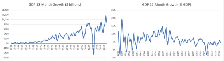
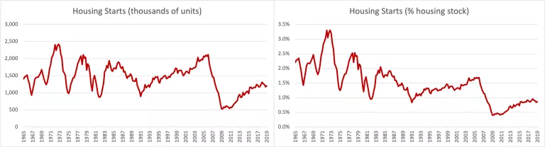
Figure 2 shows the equivalent charts for housing starts. Here, the data adjustments don’t appear to be necessary; the number of housing starts doesn’t keep getting larger and larger each year. But even though it doesn’t seem visually necessary to transform housing starts, it is conceptually necessary. In the past I did not recognize the necessity of transforming the housing start data, but now I realize how critical this simple error has been.
Figure 2. Housing Starts Expressed as Absolute Numbers (Left) and As a Percentage of Total Housing Stock (Right)
Since the transformation is rarely performed, the typical analysis of housing markets begins with the sort of analytical bias we would have if we only viewed GDP growth as shown in the left panel above, on a normal scale with absolute values. If analysis of GDP were done this way, instead of debating about the finer details of The Great Moderation, macroeconomists might be holding conferences in exasperation about how GDP seems to be increasingly volatile, regardless of what policies we implement. Fifty years ago, GDP growth didn’t vary by more than $10 or $20 billion from quarter to quarter, but today, it might increase by $900 billion one quarter and only $500 billion the next. Doesn’t that sound a lot like the public dialogue on the housing market?
The public dialogue on the housing market should begin where dialogue on GDP growth begins—with a common understanding that the past 40 years have mostly been characterized by the lengthening of the business cycle and less volatile growth from year to year. Instead, public dialogue revolves around the opposite presumption. As a result, there is constant pressure to lower production of housing because any increase in construction is incorrectly associated with volatility.
Figure 3 compares the change over time in the 15-year rolling averages and rolling standard deviations of the annual GDP growth rate and annual housing starts stated as a percentage of the housing stock. They follow remarkably similar patterns. In fact, if anything, moderation (the reduction in standard deviation) in housing starts—even at the top of the so called “housing bubble” in 2005—has been stronger in housing than in GDP growth.
Figure 3. Comparing GDP Growth Rate with Housing Starts as a Percentage of Housing Stock: 15-Year Rolling Averages and Rolling Standard Deviations
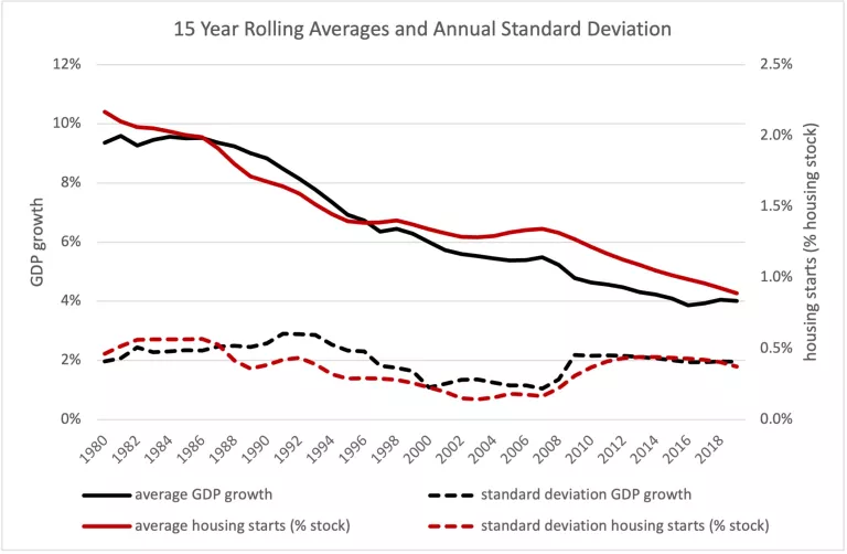
From 2000 to 2007, the annual volatility in the rates of housing starts and GDP growth was at a historic low. Average growth rates were at historic lows, too. Curiously, that period is frequently described as a time when The Great Moderation in GDP growth was thrown into a deep recession because of an extreme boom in housing. But that analysis comes from looking at GDP growth from the right panel of figure 1 and looking at housing production from the left panel of figure 2—in other words, from not comparing like with like.
There may be good reasons for housing production to decline over time, as a percentage of the existing stock. If population growth is slowing, for example, a decline in the growth rate of the housing stock isn’t necessarily a problem. However, at least before the 2007–2008 financial crisis, population growth hadn’t been slowing nearly as much as the rate of housing starts had. From 1965 to 1990, U.S. population grew by about 29%, and the number of households grew by about 63%. From 1990 to 2015, U.S. population grew by about 29% again, but the number of households grew by only 33%.
One reason so many more homes were built in the U.S. before the 1990s is because households were getting smaller: If each house has fewer people but the population grows or remains constant, more houses are needed. Changing household size has been a more important influence on housing construction over time. The effect of changing household size scales with the size of the housing stock and the population. Additionally, vacancies, seasonal homes, second homes and so on also scale with the size of the housing stock and the population.
This is why housing start data should be scaled over time. A 1% decline in average household size would require a 1% increase in the number of homes available. That would require the construction of many more homes in 2020 than it would have required in 1960. Likewise, if the economy is strong and 1% of households decide they can afford a vacation home, that also scales with the size of the population. Analysis of cyclical fluctuations in construction must account for this changing scale.
Figure 4. Housing Vacancies and Housing Starts in Absolute Numbers (Thousands of Units)
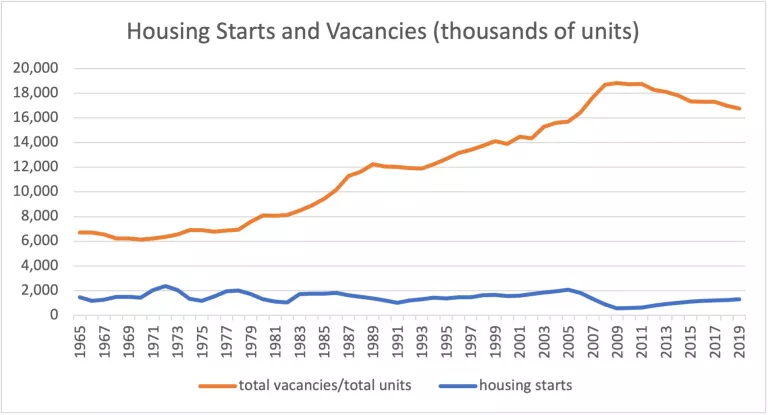
Consider housing vacancies. Figure 4 compares vacancies and housing starts over time without a transformation, that is, in absolute numbers. The number of vacant homes generally has increased over time, for the simple reason that the country is larger and there are more homes in general. Housing starts have just moved along sideways. That is really strange! The U.S. is a much larger country than it used to be.
Think of it this way. In 1970, there were about four vacant homes in the U.S. for every new home started that year. Some were for rent or sale, and some were second homes, seasonal homes, homes under repair, etc. In 2005, there were about eight vacant homes for each home started. In 2019, there were nearly 13 vacant homes for every new home started. Imagine if housing starts doubled next year and every single one of those extra homes sat vacant. The number of vacant homes would increase from about 17 million to 19 million. The increase in vacant units would be practically imperceptible to the casual observer because the overall amount of construction has not increased as the country has grown, unlike the number of occupied homes, the number of vacant homes, the number of young adults who might decide to move out of their parents’ house next year, the number of families who might decide to build a seasonal cabin, etc. A change in any of those factors would cause a percentage increase in the number of new homes that Americans decide to build, which adds up to a lot more homes (in absolute numbers) than it would have in 1965.
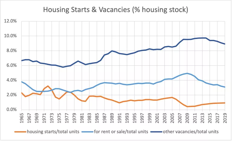
Figure 5 compares housing starts and vacancies in the way that vacancies are usually stated—as a percentage of the housing stock. Here, I have separated vacancies into temporary market vacancies (homes for rent or sale) and other vacancies (seasonal, second homes, etc.). There has been some increase in the vacancy rate over time, but part of that increase is due to changes in the way the Census Bureau counted homes during the 1980s.
How different would the conversation about housing be if this were our starting point? How different would policy discussions after 2005 have been if, instead of wondering what to do about rising vacancies when housing starts were over 2 million units a year, we had been asking, “Why are vacancies rising when housing starts are at a moderate 1.7%?” Or what if it had seemed reasonable to ask, in 2005, “Could home prices be high because of these stagnant housing start numbers? Could more housing starts help bring down high home prices?” Had we been looking at the housing start data from the correct perspective, the 2007–2008 financial crisis might not have happened.
Figure 5. Housing Vacancies and Housing Starts As a Percentage of Total Housing Stock
If housing is to be considered (wisely) as a cyclical factor in the economy, then it needs to be considered consistently. One step toward viewing the housing cycle more consistently would be to analyze housing starts as we typically analyze vacancies—as a percentage of the existing stock. Doing so will enable better analysis of the housing market and potentially avert catastrophic policy errors such as those that led to the 2007–2008 financial crisis.