- | Government Spending Government Spending
- | Data Visualizations Data Visualizations
- |
Government Spending: A Recap
Using data from the Office of Management and Budget, this chart shows the amount of real federal dollars spent per capita over the past 40 years. The data clearly highlight that, after adjusting for population and inflation, federal outlays have, with a few exceptions, mostly grown, with a clear increase over the past 12 years.
Government spending was a central issue in the 2010 elections, and it has remained an important concern in this election cycle, especially for independent voters.
Using data from the Office of Management and Budget and the Department of Treasury, this chart shows the amount of real federal dollars spent per capita over the past 40 years. The data clearly highlight that, after adjusting for population and inflation, federal outlays have, with a few exceptions, mostly grown, with a clear increase over the past 12 years.

The first Carter budget spent $6,892 per person, and president Reagan’s first budget spent $7,250. His successor’s first budget spent $8,368, and president Clinton’s first budget spent $8,248. Remarkably, the Clinton era oversaw a decline in the per capita spending—from $8,248 to $8,047 over eight years. But that trend was radically reversed during George W. Bush’s two terms. Bush’s last budget is $11,644. Some of the fiscal year 2009 spending was a result of President Obama’s so called stimulus bill. However, President Bush is still responsible for most of this year’s spending. Since then spending in real terms per capita has remained fairly constant, and even declined in fiscal year 2012.
Spending increases are projected to continue, driven by the fiscal demands of programs such as Social Security, Medicare, and Medicaid. This chart—and the supporting charts below—provide further evidence that this country has a spending problem and needs to start making cuts to restore government spending to sustainable and responsible levels.

Chart supplement 1
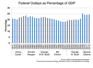
Total federal outlays measured relative to total economic output or GDP. Measuring outlays as a portion of GDP shows how much spending grows with respect to the total amount of wealth produced within a given year.
Chart supplement 2

Gross domestic product, 1977–2011. This chart shows the evolution of the nation’s total economic activity. The 2012 data is projected.
Related Content
- | Government Spending Government Spending
- | Data Visualizations Data Visualizations
Budget Deficits: Past and Promises
- | Government Spending Government Spending
- | Data Visualizations Data Visualizations
Austerity By the Numbers

- | Government Spending Government Spending
- | Data Visualizations Data Visualizations
Projected Spending from House Republican and White House Budget Plans
- | Academic & Student Programs Academic & Student Programs
- | Monetary Policy Monetary Policy
- | Policy Briefs Policy Briefs

