- | Monetary Policy Monetary Policy
- | Policy Briefs Policy Briefs
- |
Housing Was Undersupplied during the Great Housing Bubble
The lack of a strong recovery since the 2007–08 financial crisis has been a central theme of many economic discussions over the past decade. We might normally expect an especially deep economic contraction to be followed by an especially strong recovery. Why was this recovery different? One of the more widely cited causes of the slow recovery has been a surplus of homes left over from the boom.
In his memoir, former Federal Reserve Chairman Ben Bernanke wrote, “Normally, a rapid rebound in home construction and related industries such as realty and home improvement helps fuel growth after a recession. Not this time. Builders would start construction on only about 600,000 private homes in 2011, compared with more than 2 million in 2005. To some extent, that drop represented the flip side of the pre-crisis boom. Too many houses had been built, and now the excess supply was being worked off.”
What Supply Overhang?
How bad was the supply overhang? Surprisingly, the answer may be that there never was one.
We can think about this in terms of stock (the number of homes in the United States) or flow (the rate at which new homes were being built).
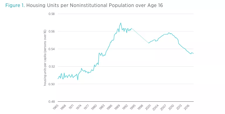
In terms of stock, the Census Bureau maintains estimates of both US population and the number of housing units. As shown in figure 1, the ratio of homes to adults in the United States rose in the 1980s as a result of factors such as changing marriage norms. The ratio then declined in the 1990s. The relative number of housing units increased somewhat from 2000 to 2005 but remained below the previous peak level. After the crisis, the decline continued.
In terms of flow, the Census Bureau measures the construction of several forms of housing. Figure 2 shows the rolling five-year level of new housing starts (including manufactured homes, homes in multi-unit properties, and single-family homes) compared to total population growth (light blue line) and compared to adult population growth (dark blue line). The rate of housing starts was not unusual by either measure during the 2000–2010 period, and has since moved well below long-term norms.
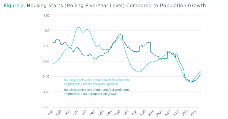
Figure 3 stacks the numbers of new housing units started or shipped over time. Single-family homes, at the bottom, make up the bulk of new housing units. Manufactured homes and multi-unit homes, which make up a relatively small portion of new housing units, stack on top. The horizontal dashed line shows the average number of new units built annually from 1959 to 2005—just before the crisis.
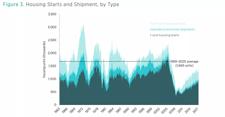
When including all types of units, this measure also suggests that nothing out of the ordinary was going on before the financial crisis. The number of housing units added during the boom was only slightly above the long-term average.
The Census data provide surprisingly little support for the claim that there were too many homes in 2005. Figure 3 provides a couple of hints about how policymakers came to believe that housing supply had been excessive and why, in fact, supply has actually been constrained. The number of single-family home starts, especially single-family homes built for sale, did rise to unprecedented levels. That is a high-profile category, where publicly traded homebuilders operate and where many families become new homeowners.
But the other categories were either stagnant or in decline over the long term. The growth in single-family homes built for sale came mostly by taking market share from the other types of units.
What caused this shift? The other categories face increasing regulatory hurdles: most notably, obstacles to housing expansion in several urban centers where many multi-unit properties would normally have been built.
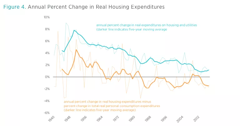
Another way to measure the growth in the housing stock is to measure real expenditures on housing over time. Figure 4 shows the long-term annual growth in real housing expenditures (dark blue line). Housing consumption has been increasing more and more slowly over time. The dark orange line measures the growth in real housing expenditures minus the growth in total real spending. This raises the question, Was real consumption of housing growing more quickly than real consumption in general? As real income increases, is housing a larger portion of the new basket of goods and services or a smaller portion than it had been before?
Households have been increasing their consumption of housing more slowly than they have increased their consumption of other goods. The idea—frequently claimed—that there was a housing bubble in the 2000s that was the result of Americans “keeping up with the Joneses,” buying trophy houses or overinvesting in new homes in a misguided attempt at saving or speculating, is wrong. Americans have been doing the opposite.
The Closed Access Problem
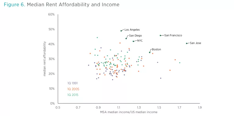
Just a few cities are at the heart of the housing supply problem, most notably New York City, Los Angeles, Boston, and San Francisco, which I refer to as Closed Access cities. There are two very different housing markets within the United States: the Closed Access market, where new housing is highly constrained, rents rise relentlessly, and households are forced to make difficult choices as housing expenses eat up their budgets; and the rest of the country, where homes can generally be built to meet demand, housing construction is healthy, and housing expenses remain at comfortable levels for the typical household.
If we add these two markets up into an aggregate market, it looks like a market where rents are relatively level over time. In the 2000s, when housing starts were rising and home prices were also rising to unusually high levels, it appeared as if those rising prices were unrelated to rent, and it appeared that prices were rising at the same time that supply was rising. This pattern, rising prices and quantities, seemed to be the result of excess demand—too much credit and too much money funding too much housing.
Yet few places fit that description. For the most part, there were places where housing starts were low, while rents and prices were both rising, and there were places where housing starts were healthy, while rent and price increases were moderate. If we compare median annual rent and median home price within each metropolitan area, it is clear that rents were an increasingly important determinant over the past two decades of home price differentials between different metropolitan areas. And as shown in figure 5, in this regard, the Closed Access cities have become outliers—much higher rents leading to much higher prices.
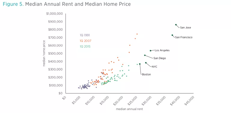
From 1996 to 2005, across the United States permits were issued to build 6.5 homes per 100 residents. The Los Angeles, Boston, and New York metro areas each approved fewer than 2.6 per 100 during that time. San Francisco approved 3.4. In contrast, other economically prosperous cities that attract aspirational families in search of economic opportunity, such as Washington, DC, Seattle, and Dallas, issued permits at rates higher than the national average.
The Closed Access Migration Event
Contrary to Chairman Bernanke’s assumption, at the national level there was no overhang of housing supply that needed to be worked off in 2011. Indeed, even in 2005 there was no national oversupply of housing. Rather, the American economy was burdened by a shortage of housing, especially in the Closed Access cities.
The housing bubble was concentrated in cities in the coastal Northeast, California, Nevada, Arizona, and Florida. Limiting our analysis to the 20 largest metropolitan areas, the Closed Access cities make up three-quarters of the “bubble” cities, in terms of total real estate valuation. Constrained housing supply was clearly the primary source of high prices in those cities, not excess demand. Prices in the Closed Access cities today remain as high relative to other cities as they were during the bubble because constrained supply is the fundamental reason for those high prices, not reckless credit markets.
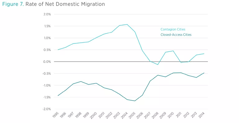
Even in other bubble cities with generous building policies, the primary cause of rising prices was the severe Closed Access shortage of housing. This is because those other bubble cities were the main destinations for households migrating out of the Closed Access cities. I call those cities Contagion cities, because in spite of their more generous building policies, they were overwhelmed by the problem created by the Closed Access cities. In the years leading up to the financial crisis, the shortage of housing in the Closed Access cities had become so severe that each year hundreds of thousands of households moved away in search of an affordable home. Many of them landed in inland California, Nevada, Arizona, and Florida.
Figure 7 compares net domestic migration of Closed Access cities and Contagion cities. Notice that high rates of out-migration from Closed Access cities correspond to periods of large in-migration to the Contagion cities. Credit markets may have facilitated some of the housing activity during the housing bubble, but at its core this was a mass migration event caused by a lack of housing.
The Mystery Is the Collapse of Demand
For many people, it seemed obvious that there was overbuilding in places like Phoenix. From 2003 to 2005, Phoenix built many homes. Meanwhile, prices of Phoenix homes rose by about 75 percent in just two years. By 2007, however, the Phoenix housing market was collapsing, buried in a mountain of unclaimed inventory. Surely, it was argued, this was a classic credit-fueled boom and bust.
But, for the boom-and-bust story to add up, Phoenix would have had to build enough homes for all of those new households moving in from California, and then it would also have had to build tens of thousands of units in addition to that. It couldn’t. The problem Phoenix encountered was that the in-migration was so strong that even Phoenix authorities couldn’t approve new supply fast enough to meet demand.
Building permits in Phoenix jumped by about 50 percent from 2001 to 2004. By all appearances, that is an extremely frothy market, but as figure 8 shows, the jump in new homes tracked virtually 1:1 with net in-migration.
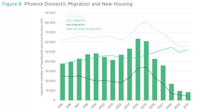
By 2006, Phoenix had a growing number of empty homes and a large inventory of homes for sale. But from 2005 to 2008, the number of new homes approved in Phoenix dropped faster than net migration was dropping. Housing supply had reacted remarkably quickly to shifting demand. Even as housing starts were collapsing, rents were rising, as they were in most cities at the time.
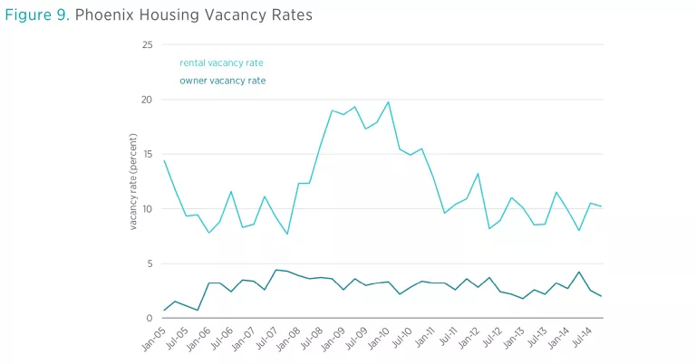
Furthermore, housing vacancies in Phoenix followed an interesting pattern. As figure 9 shows, vacancies among owned homes rose in 2006, but vacancies among rentals remained stable until 2008. In most other cities, there wasn’t a systematic shift in vacancies. This pattern is mostly limited to the Contagion cities that had been exposed to Closed Access migration events. There were plenty of tenants for the housing units that existed in 2006. What those housing markets lacked were buyers. There was not an oversupply of homes in Phoenix. There was an undersupply of buyers. By 2008, when rental vacancies rose, the problem was that a decades-long flow of migration had suddenly dissipated to a dribble.
What caused the massive out-migration from the Closed Access cities? The answer to that question is also, fundamentally, that there weren’t enough houses.
This leaves one additional question that has been rarely asked, and which must be answered if we are to come to terms with the crisis that followed. If a lack of housing was fundamentally the cause of the housing bubble, then why had housing starts been collapsing for more than a year before the series of events occurred that we associate with the crisis, like nationally collapsing home prices, defaults, financial panics, and recession? And what caused the Closed Access migration event to suddenly stop at the same time as the collapse of housing starts?
For a decade, the collapse has been treated as if it was inevitable, and the important question seemed to be, What caused the bubble that led to the collapse? This needs to be flipped around. Given the urban housing shortage, it was rising prices that were inevitable. So the important question is, Why did prices and housing starts collapse even though the supply shortage remains? And why were housing starts still at depression levels in 2011?
The surprising answer to those questions may be that a housing bubble didn’t lead to an inevitable recession. It may be that a moral panic developed about building and lending. The policies the public demanded as a result of that moral panic led to a recession that was largely self-inflicted and unnecessary. They also led to an unnecessary housing depression that continues to this day.

