- | Government Spending Government Spending
- | Policy Briefs Policy Briefs
- |
The Economic Situation, September 2012
The U.S. economy has not been healthy since 2001 when 9/11 pushed the country into a recession. As the accompanying data tell us, real GDP growth has risen to meet the long-term average of 3.11 percent just once since 2001, and that was in 2004. The combination of wars, financial collapse, natural disasters, and political games has taken a heavy toll on economic growth. No one is talking about 3 percent or better growth anytime in the foreseeable future. But it’s not just about Democrats and Republicans. It’s about something deep in the economy.
September 2012
- The mid-year economy
- How it feels depends on where you live
- Whither the price of gasoline?
- Feeling over-regulated?
- Time and the power of compound interest
- What lies ahead?
The Mid-Year Economy
Imagine a team of doctors hovering over the bed of the U.S. economy. With charts in hand and apparatus all around them, the medical team confers about a patient that has been in intensive care since June of 2009, which is when the recession ended. While the patient listens, the senior physician makes a quick rundown:
Unemployment: 8.3 percent.—Should be 4.5 percent by now.
GDP growth: 1.7 percent.—Should be at least 3.1 percent.
Debt to GDP: 104 percent.—Should never be above 80 percent.
Runaway regulation.—Count of major rules in the works is excessive.
Moribund housing pulse.
Weak lending rate.
The second physician counters with this:
Retail sales are up.
Chemical and metal production is recovered.
Auto production is almost fully recovered.
Corporate profits are in great shape.
Exports are healthy.
Not bad from where I stand.
The patient stirs and responds: Maybe I should just get up and get to work.
It all depends on where you look and live. At mid-year 2012, three years after the recession ended, we have a mixed-bag economy.
The Economy Is Like a Box of Chocolates
Yes, autos, chemicals, paper, nonferrous metal, along with healthcare, and professional and business services are soaring, but anything close kin to housing, real estate development, and construction is lost in the woods of the last recession.
No, the private sector is not doing fine, in spite of President Obama’s more optimistic assessment. In fact, the situation is more like Forrest Gump’s box of chocolates. The uncertainty is great that “you never know what you are going to get.”
When tax policy is up for grabs, monetary policy is anyone’s guess, and a regulatory cliff lies ahead, it depends on which sector you choose and where you live.
The U.S. economy has not been healthy since 2001 when 9/11 pushed the country into a recession. As the accompanying data tell us, real GDP growth has risen to meet the long-term average of 3.11 percent just once since 2001, and that was in 2004. The combination of wars, financial collapse, natural disasters, and political games has taken a heavy toll on economic growth. No one is talking about 3 percent or better growth anytime in the foreseeable future. But it’s not just about Democrats and Republicans. It’s about something deep in the economy.
The United States has its own version of Europe’s disease. But we have something they lack: the world reserve currency. We can print money and the world will take it . . . at least for now. Because of our ability to print money, it seems a whole lot easier to tell Italy, Spain, and Greece how they should cut debt, reduce the size of government, and reduce the power of unions than to apply the same treatment to ourselves. We can whistle while walking through the cemetery.

The Two Different Worlds We Live In

Back in the 1950s and 1960s, people spoke of the West and the rest. The western world was the economic engine. The recipe for producing economic growth seemed best understood by the people of the OECD nations. These, called the industrial nations, included all of Europe, the United Kingdom, North America, and Japan. Though not immune to making policy errors that brought on inflation, recessions, and hardship, the Western world still had an admirable record of economic growth and prosperity. Huge amounts of wealth were created, and we today live on the legacy of that time.
But things have changed for the better in the rest of the world. It is the rest that is generating high-paced GDP growth and prosperity. The accompanying chart suggests something happened along about 1991. Before that year, the West and rest were zigging and zagging together.
The rest parted company with the West in 2001.
Some suggest that sharply falling transportation costs, improvements in supply chain management and more secure property rights have made it possible for sophisticated production to take place across a larger part of the world today. Low transportation and communication costs make it possible for components to travel to several countries and back again in the production process. Instead of huge plants that derive ultimate economies of scale and then ship from there to the world, there can be clusters of plants located in various places that together generate lower overall costs. Along with these cost and production improvements, increases in economic freedom worldwide empower people to connect their creative minds and muscle to the world’s wealth engine. Whatever the recipe, we know the result. As the data here demonstrate, we live in two different worlds.
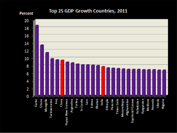
How It Feels Depends on Where You Live
Recently reported 2011 world GDP growth provides the picture. As shown here, the top-25 countries have growth rates that range from 18 percent to a bit more than 6 percent. The West is not represented. Most of the countries shown are small, but two are massive. China and India are still pumping iron, even in the face of a slowing world economy.
But we don’t have to move to Qatar, Ghana, or China to find bright prospects. We can move to North Dakota, Texas, or Utah. The next map shows state GDP growth for 2007-2011. The chart after that looks at a thinner tissue sample, the growth between 2010-2011. The first map’s longer view causes us to focus on the middle of the country. This is where energy of all forms is produced, and also where educational attainment is high. These are the commodity states and also the location of the burgeoning knowledge economy. I will delve a bit deeper into the knowledge economy later.
As we get to the current margin, the second map tells us that now the West and East are being favored. These are the recovering regions. Having fallen to the cellar in the earlier years, growth rates are now higher. Through it all, North Dakota, Texas, and Utah are pace setters for the rest of the country.


Searching for the New Economy
The New Economy, or knowledge economy, is characterized by 1) entrepreneurship, 2) fast growing firms, 3) a large presence of scientists and engineers, and 4) high levels of R&D expenditures. Identifying New Economy strength is a way to mark places where future incomes will be highest. The Information Technology & Innovation Foundation maintains data on the states and periodically produces a State New Economy Index for the states. The report can be viewed here.
The most recent 2010 report listed the nation’s top 10 states as: Massachusetts, Washington, Maryland, New Jersey, Connecticut, Delaware, California, Virginia, Colorado, and New York. The rankings were based on more than 20 criteria. These included measures of globalization, patent production, high tech employment, and new firm IPOs, as well as the four items mentioned above.
Virginia made the top 10 listing. What about the Southeast?

To make things simpler, I picked the four items listed above, applied them to southeastern states, and averaged the rankings for each. Here’s what I got. Notice that Texas, a strong GDP growth state, ranks at the top of the region’s New Economy class. But Georgia, which is one of the weaker states in terms of current GDP growth, ties with Virginia, a strong GDP growth state. What appear to be anomalies make the list interesting. It is obviously possible for a state to have a much brighter future than revealed by current data.
Whither the Price of Gasoline?
The combination of Hurricane Isaac, refinery fires, Labor Day driving, and our deficit habit pushed August gasoline prices higher throughout the month. By the time September rolled around, the average price of unleaded self-serve gasoline nationwide stood at $3.84 per gallon. In January, the price was $3.29. That’s a whopping 54 cent or 16 percent increase in eight months. Higher priced gasoline seemed to have arrived to stay. And with presidential hunting season running at full blast, some in the Obama Administration were talking about tapping the strategic fuel reserve in the hope of giving some relief.
But the $3.84 price is one of those averages that no one may really pay. There are 17 EPA-required gasoline recipes used across the country. This means gasoline in South Carolina will not do in California. At the end of August, folks in the Golden State were paying $4.00 a gallon for their special formula.
What can we expect in the days ahead? Are we again facing a higher gasoline price trend?
To get some perspective on this, I provide an update for my oil/gold chart that appears regularly in this report. Recall the chart speaks to the question: How much oil will an ounce of gold purchase? Historically, the answer has tended to be 20 barrels. The next chart shows the annual oil/gold relationship for the years 1969 through 2011. I have marked the oil embargo years when an ounce of gold would buy much less oil as well as the years when oil prices were deregulated and oil got cheaper. The data in the chart also tell us what happens when we drop bombs on oil producing countries. The price of oil shoots up. The last few observations suggest that oil is getting cheaper, with the number of barrels fetched for an ounce of gold headed toward 20 again.

But what about now? Is there anything other than hurricanes, fires, and other temporary factors pushing oil prices higher?
Looking at the oil/gold relationship for 2012 is instructive. In January 2012, an ounce of gold bought 15.9 barrels of oil. In August 2012, an ounce of gold bought 17.9 barrels. The price of oil fell 12.5 percent. But remember, we shop with dollars, not gold. So what happened? The gold price of oil went down 12.5 percent, but the dollar price of oil went up 16 percent! In a word, the dollar weakened in world markets.
So, aside from Hurricane Isaac, who can we blame for higher priced gasoline? Arab traders? OPEC? “Big Oil”? How about our political agents who set monetary and fiscal policy? The folks who manage the deficit? As a result of uncertainties regarding deficits, debt, inflation, and U.S. credit worthiness, world currency markets just don’t like dollars as much as they did in January. But we still like gasoline!
Will things get better or worse? I think we will see slightly lower oil and gasoline prices for the rest of this year. The world economy is slowing, hurricane season will pass, we are no longer dropping bombs on oil producing countries, and a huge amount of oil and natural gas is now being pumped on American soil.
U.S. average gasoline prices should fall in the direction of $3.20.
Feeling Over-Regulated?
In previous reports, I have provided charts showing the count of Federal Register pages to illustrate the extent to which the U.S. economy is becoming a command-and-control economy. Growth of Federal Register pages is a rough proxy for expansion of government control of the private sector. Each new page of rules or revisions of rules forms another thread that limits movement of the Great American Bread Machine.
Recently, Patrick McLaughlin at George Mason University’s Mercatus Center developed another way of measuring the extent to which specific U.S. industries are becoming more or less constrained by regulation. Patrick and his colleagues came up with a set of metrics of regulation and made them available in the Industry-specific Regulatory Constraint Database. The McLaughlin data can be viewed at www.regulationdata.org.
One metric is based on the frequency with which constraining words appear in the Code of Federal Regulations (CFR). All final rules that appear in the Federal Register ultimately find their way into the CFR. Using new technology for reading and scanning text, the McLaughlin team can generate an annual count of the number of times strings of words appear that contain any and all of the following terms: "shall,” “must,” “may not,” “prohibited,” and “required.” The higher the count, the tighter regulation constrains economic activity.
But instead of looking only at how constraining federal regulations are, the McLaughlin team also measured the degree to which particular industries are targeted by regulation. They used a similar approach, only this time counting the number of times keywords related to specific industries are mentioned in the text of the CFR. The result is a measure of how relevant the constraining text is to each industry in the U.S. economy. In fact, by combining this measure of industry relevance of CFR text with their measure of how constraining the text is, McLaughlin and his colleagues have produced a measure of how regulated each industry is in each year from 1997 to 2011. They call this the Industry Regulation Index. The more rapid the growth of the Industry Regulation Index, the more binding the state control of the industry in question.
To give an idea of what the new index reveals, I show in the next chart the index averaged for all industries and four specific industries: Oil and Gas Extraction, Paper Manufacturing, Chemical Manufacturing, and Rail Transportation. Each observation in the chart shows the growth rate of industry-targeted regulation. And each series begins in 1997, which is set to 1. As indicated, Paper Manufacturing has become much more highly regulated than the other three industries. The Paper Manufacturing industry faced 39 percent more regulations in 2010 than in 1997, while Chemical Manufacturing and Oil and Gas Extraction were targeted with 26 percent more regulation in 2010 than in 1997. Finally, the Rail Transportation industry saw a 21 percent increase between 1997 and 2010, which was just about the average for all U.S. industries.

Time and the Power of Compound Interest
The power of continuously compounded interest is truly amazing. Starting with an initial value, continuous compounding at even a low rate of growth can lead to amazing outcomes across the years. Consider China, India, Russia, and the United States, four countries with sharply different current per capita income levels and GDP growth rates. Think what can happen, and most likely will happen, to the level of living in those four countries over the next 30 years. The next chart shows the results for different growth rates for the four countries.

As indicated, if China continues to grow at 9 percent or better, as the country has for the last 10 years, China will have a per capita GDP of $124,990 in 30 years. India starts at a lower current income level. At 9 percent growth, the country will hit $54,000 in 30 years, about the same as the current U.S. per capita GDP. With just 3 percent growth, Russia’s will hit $41,000 in 30 years. And notice that if the U.S. grows at just 3 percent a year, something to dream about right now, per capita GDP will hit $120,000 in 30 years! If you feel pessimistic about all this, take a look at the 2 percent growth rate. Even that will generate sizable levels of income in three decades.
Some readers of this report are old enough to recall what life as a working adult was like 30 years ago and how unbelievable it was then that we would see the current levels of world prosperity. Well, prepare yourself for even better days ahead. Higher income will not buy everything we need in life, but it generally beats lower incomes.
As Napoleon Hill would say, “Think and grow rich”!
What Lies Ahead?
We have an ample supply of political commentary arriving daily as the presidential campaign gets hotter and election day gets closer. Mr. Obama and Mr. Romney make clear that their platforms and promises describe two very different economic and social visions. Both candidates agree that spending must be cut and that tax modifications will be part of a deficit solution. They differ markedly on which taxpayers will feel the pain, and which will not. They also take sharply different positions on where to put our trust when problems arise: in government first or in the private behavior of unregulated human action.
So, what about the year ahead? What might we see between now and June 2013? I provide my assessment in the last chart. For the most part the cookies for the year ahead are on the way to the oven, but having some certainty about tax and other policies might allow for a few more cookies to go on the cookie sheet. If looking for change, 2014 will be the year to watch. Who is in the driver’s seat may make a difference by then.


